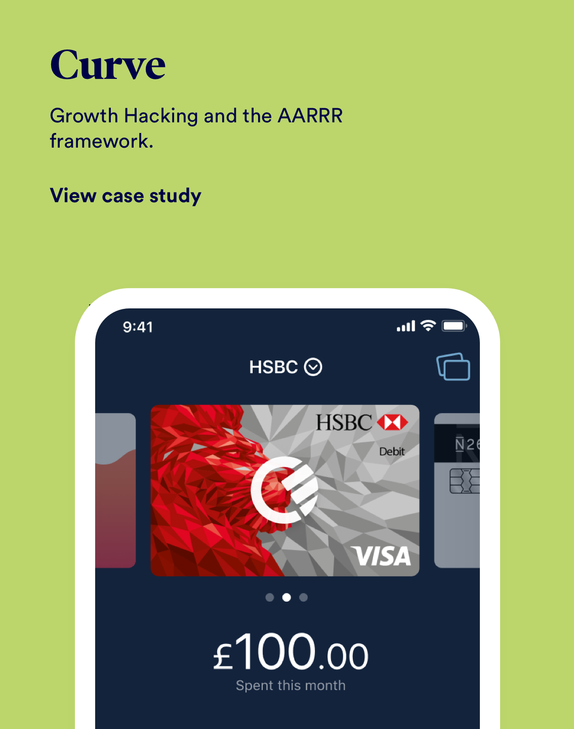
Curve
Growth hacking the AARRR funnel for a scale-up FinTech.
OVERVIEW
ROLE & DURATION
Curve’s mission is to simplify your finances. To do this successfully, you connect all of your debit and credit cards to Curve: one smart Mastercard, one smart app. This creates some really interesting problems to solve; because of our unique offering, we had a very unique set of challenges as well.
Lead Product Designer
Research, UX & UI Design, Interaction Design
1 Designer, 1 PM, 1 Eng Lead, 4 Engineers
Dec 2019 - Apr 2020
The Problem
Working as the Lead Designer on the Growth and Retention team my job was to work alongside our customer experience team to see where the pain points and opportunities lay for Curve. In a company that has been in rapid growth mode for the past 18 months, the retention of our users was key for our success going forward and I was tasked to find solutions that could help us get to where we wanted to be, to stem the flow of customer support tickets and help make our product scalable.
+3000
Customer support tickets a day created
+7500
New user sign ups a day
Better KPIs: Bigger Impact
The product teams at Curve are broken up into 4 squads comprising of 3 feature teams and the Growth & Retention Team. I worked with our leadership team to define what the OKRs would be and what kind of KPIs we could undertake to hit those targets. The company OKR is listed below.
- Make Curve customers love Curve
Rapidly adding core features to the product risked it becoming quickly fragmented. To make sure that the product stayed cohesive and that our team were building the right things for our customers, I partnered with my PM and Engineering leadership team to align on 2 product principles that would underpin our KPI’s.
- Reduce the number of customers contacting Customer Support
[CX (customer experience) tickets down -25% - Retention] - Get customers to pay for Curve
[MAU (monthly active users) on a premium tier +15% - Growth]
I began by researching as much user feedback as possible to better understand some of our core problems. I read through our Zendesk boards as well as spoke to some of our beta testers directly through our community channel. I started to get a good sense of what our users were trying to achieve and more importantly how could we build something to help them, as well as helping us achieve our business objectives.
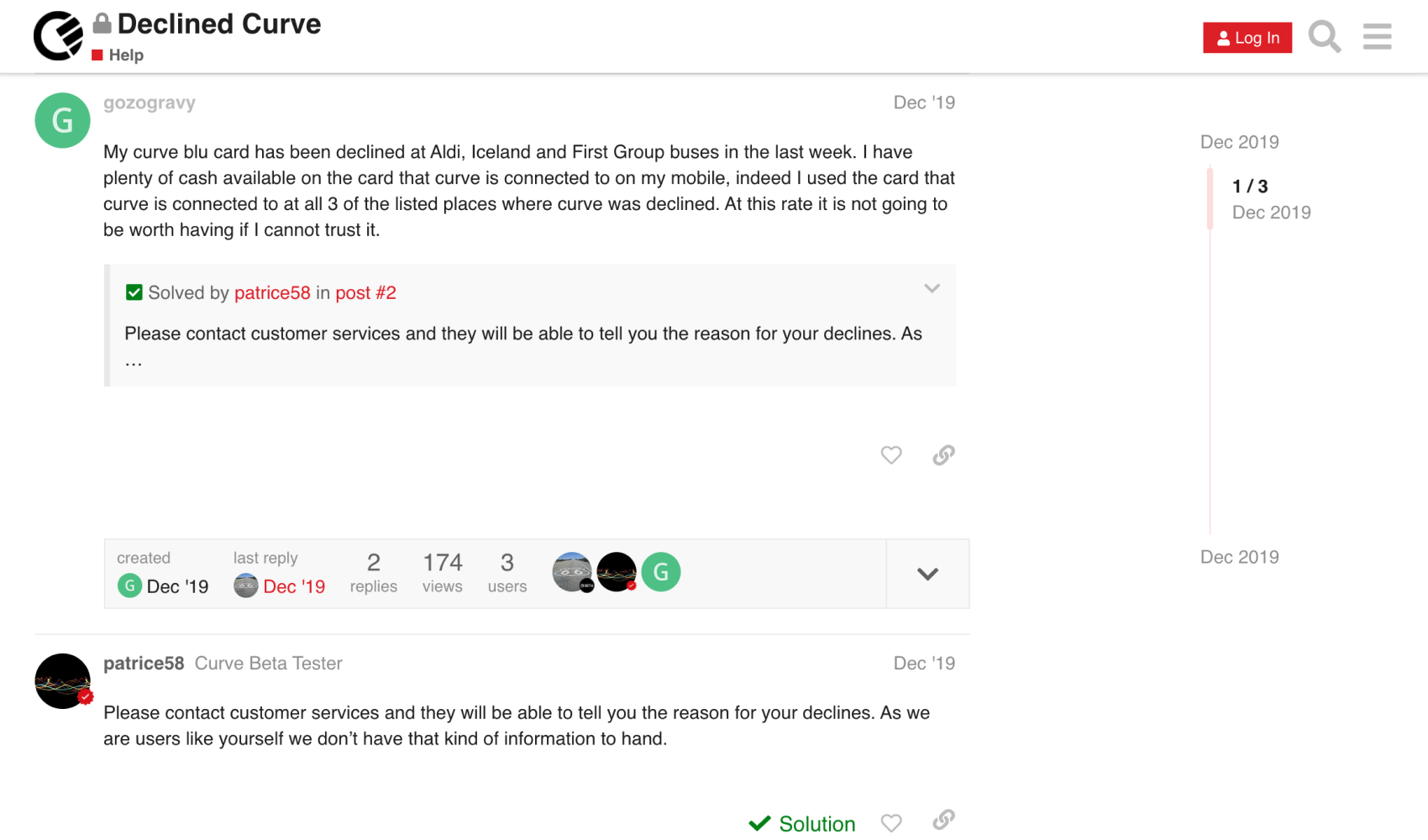
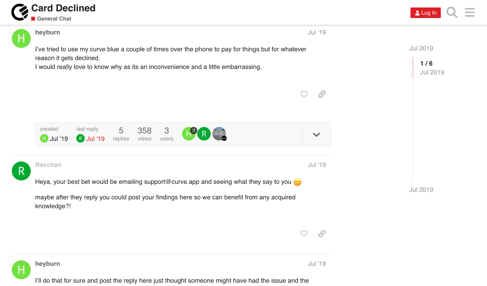
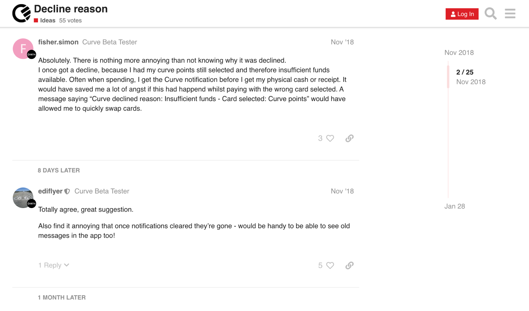
It was clear through this research that we had a major issue with declined transactions. These accounted for over 40% of all tickets created and were the source of much confusion for our users. Looking at the data further, these declined transactions were made up of about 70% insufficient funds and the majority of those were happening in the customer's first 2 weeks after signing up making it the number one reason for churn.
The goals
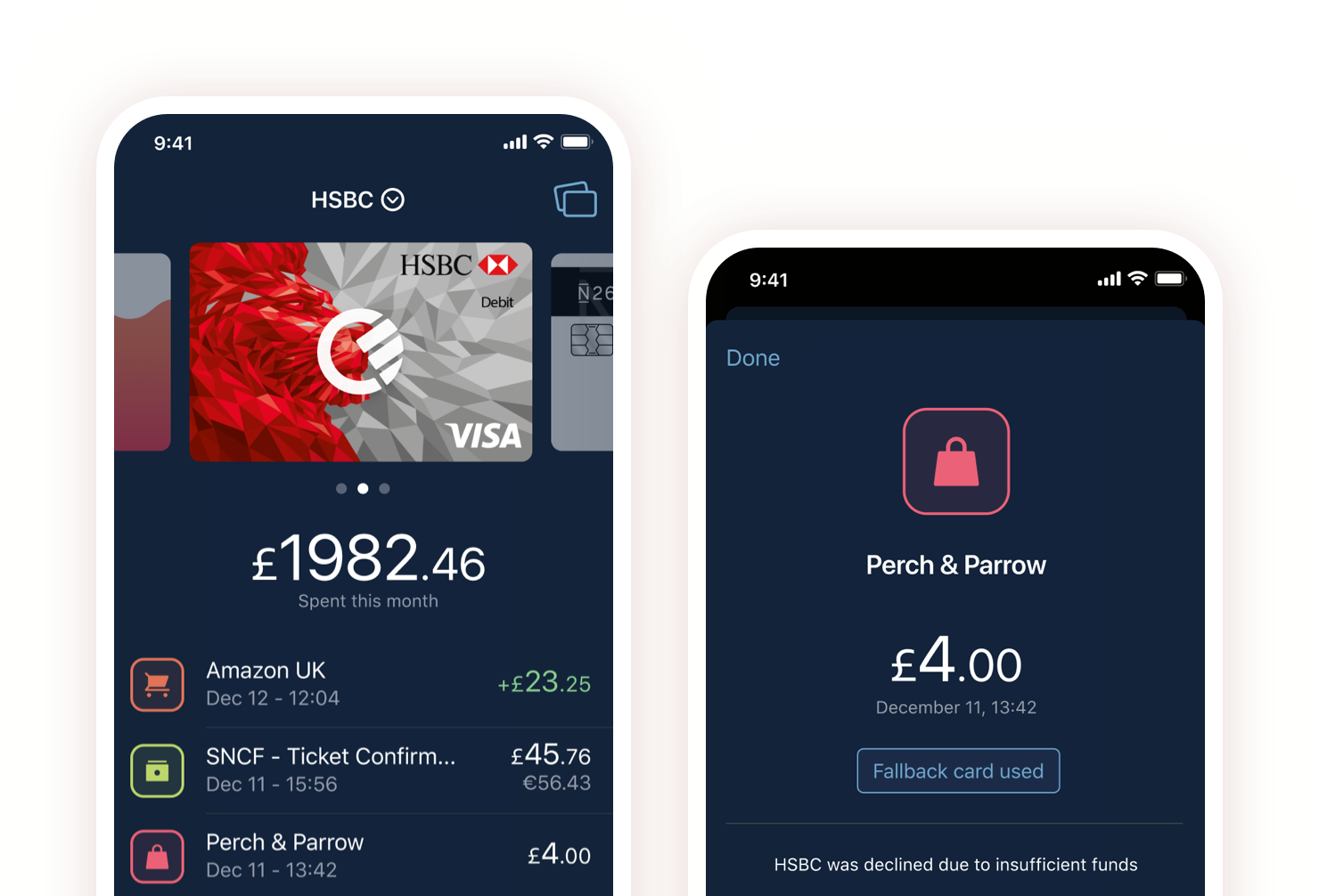
The goals for this piece of work were two-fold. Reduce the amount of customer tickets created and increase customer retention. There was an opportunity for us to solve a series of negative customer experiences by introducing the concept of smart rules. The first initiative for this, however, would be the "Fallback Card". The premise of the feature is to allow the user to select a card from their card stack to be used if they ever have any issues. The work will be done in the back end by submitting a new transaction if a decline happens, all within 2 seconds.
The challenges
This project had quite a few challenges, even though Curve is only a few years old, the wallet and transaction views hadn't been updated in 2yrs, so we had to make a call on whether we refactor these screens. This was both the case for iOS and Android. As I mentioned before as well, this wasn't the only piece of work being done at the time, we had a series of initiatives that needed to work alongside this, we had to explore how we wanted to showcase the decline within the app, what those interactions would be and also look at how we treat refunds as well.
To test these solutions thoroughly, we had to prototype a few different versions to get them into users' hands as quickly as possible, we did this via usertesting.com. We watched how users approached and clicked through each one. These 2 are just one example of the many different flows we tried, using low-fidelity mockups so that we could iterate quickly.
User research
After getting the early wireframes and flows circulated to the relevant stakeholders it was time to start working at a higher fidelity. Working with a static prototype, leveraging the current views of the app I was dogfooding the flows internally and on usertesting.com, testing different types of copy, iconography, placement. But the main thing I wanted to learn here was would they be able to action it? Again the feedback was overwhelmingly positive, the idea was understood well, there was some excitement about it, but there were some issues that needed to be ironed out.
Issues around how a user might change the card from one to another, can we support multiple cards as the default, was the card view the only place this would live, was there another space in which this could be as effective. Is there too much copy, is it self explanatory?
What we shipped
The updated flow solves most of the problems gathered from our research with a much-improved UI throughout. A clear sense of what the user needs to achieve is created with clear copy and more logical information architecture. This gives the user a sense of context as they navigate through the entire flow. Friendly, easy to understand language was added throughout. My hypothesis is that users will progress through the flow, enable the feature and we will see a major decrease in tickets, ultimately delivering the goal of reducing tickets from our users.
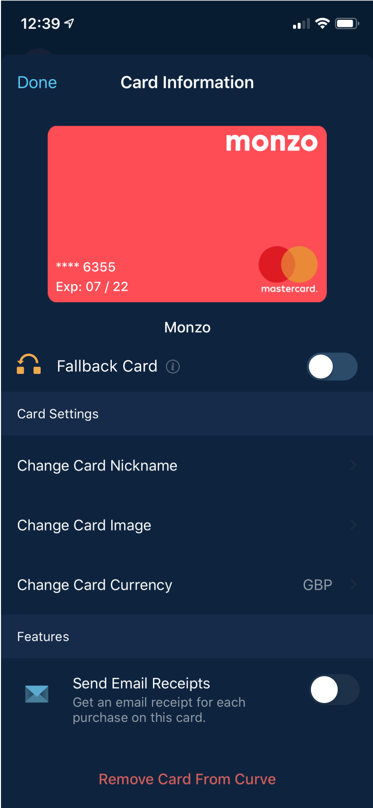
Set up
We opted for a bottom sheet as the entry point. We looked at using tooltips, full-screen take-overs, but we already had the functionality for the bottom sheet and we didn't want to be adding new components for the first iteration.
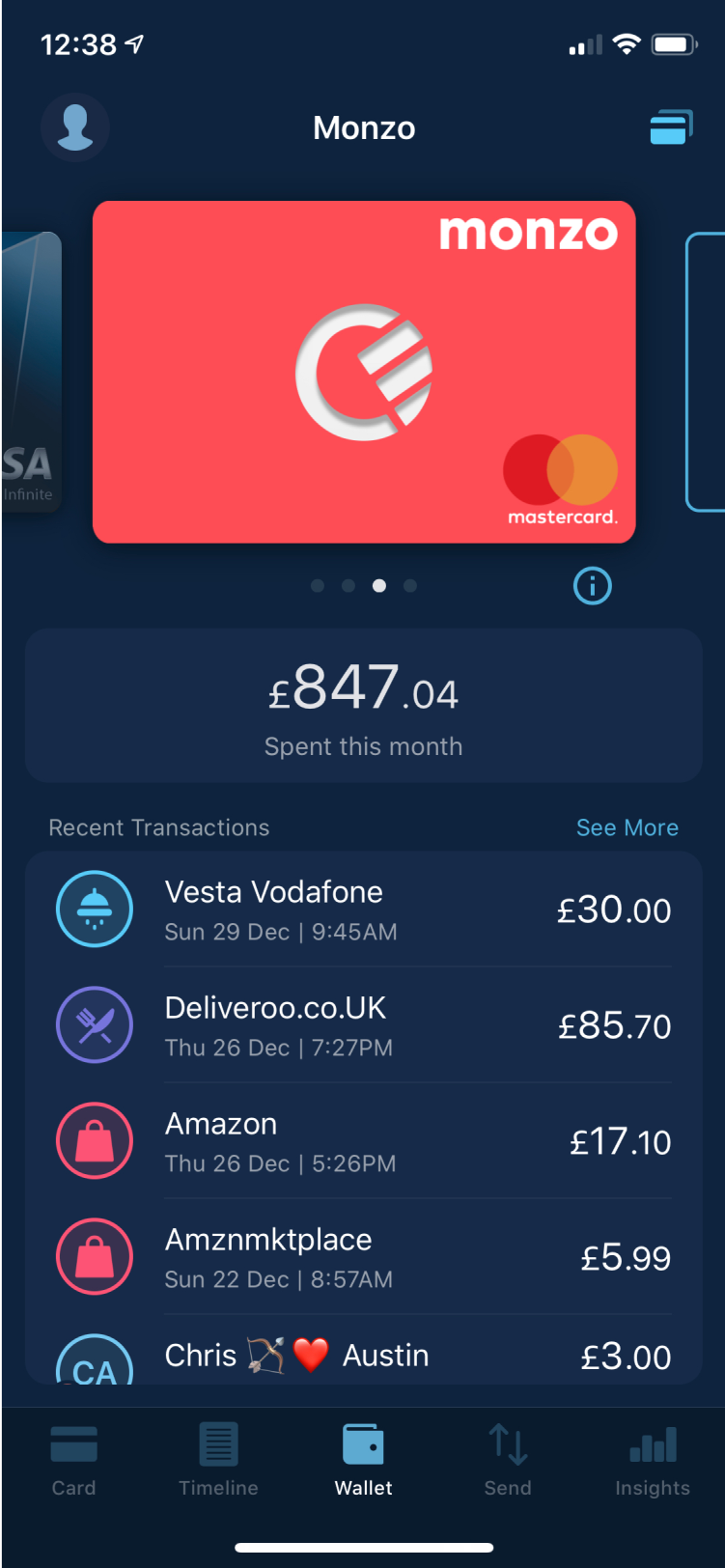
Card Selection
It was also important for the user as well to be able to control the fallback card quickly, having at the card information level as well was important for visibility. We also introduced a new UI for the list view, tabs and header area.
Switching cards
The ability to switch cards quickly and easily was also paramount to the success of this feature.
Edge Cases
We also had to work up copy for all the different edge cases, unsupported cards, expired cards, alerts and things of that nature.
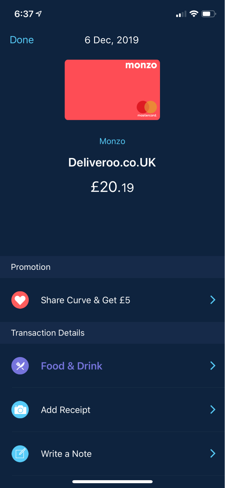
Transactions
We had to introduce a few new elements to the product to make it feature-complete, these were a new notification, updated transaction details page, and individual transaction list. This work was done in tandem with the fallback card.
Notification
We looked at sending two notifications, one for the decline and one for a new transaction, but it tested quite badly, confusing users more than being helpful. We opted to be smarter with our copy and describe what actually was taking place.
Transaction details
Throughout the whole process, it was agreed that we would also update the old transaction view which had been around since the first release, this new feature along with the decline work was going to impact this screen the most.
Did it work?
We are continuing to learn how customers are using the feature and where we can add value. We do this through, rolling user research sessions - qualitative follow ups on overall satisfaction and needs and dashboard monitoring in Looker - metrics on usage, retention and CX tickets
93%
Reduction in tickets related to declines
-17357
Tickets cleared from backlog
More Work
Meetup ProWeb Application
CurveGrowth Feature
REA GroupAndroid Application
CloudWeb, iOS & Android Applications
Let's chat!
Currently open to new opportunities remotelt or New York