Cloud
Cloud
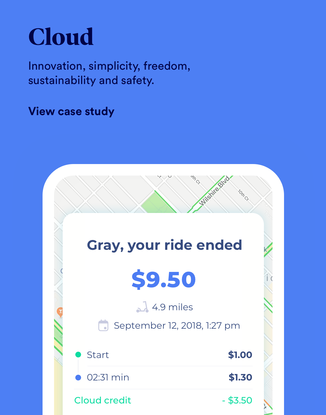
Innovation, simplicity, freedom, sustainability and safety.
OVERVIEW
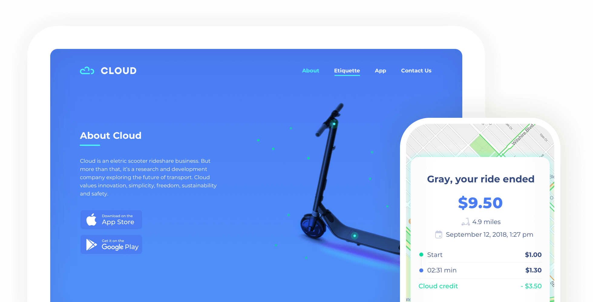
2018 was really the year that electric scooters took off. With this in mind, I was contracted to do the branding, website, iOS and Android app design for Cloud, a new transportation company wanting to join the scene.
I wanted to create a look and feel for the company that could help it stand out from an already crowded pack. Working alongside its founder, I designed all visuals and interactions and worked with a team of web, iOS and Android engineers.
ROLE & DURATION
Head of Design
Information Architecture, Interaction, Design Systems, Branding
1 Designer, 4 Engineers
The Opportunity
Cloud's vision is to make the world more sustainable, healthier, and enjoyable. They want to revolutionise city and campus mobility by helping to solve first and last mile transportation challenges and providing a system that:
● Supports efficient, affordable, and healthier transportation;
● Complements existing transit programs, reducing congestion & freeing up parking;
● Supports more vibrant downtown and residential communities; and
● Reduces local pollution from short, inefficient trips.
What is needed?
Cloud's scooter business allows riders to log into an iOS/Android App, locate nearby electric scooters on a map and immediately activate/ride the scooter for short trips. Once the trip is complete they are free to leave the scooter by the side of the road, then be charged through the app. At night, a team of users called Chargers will locate the scooters and take them to their home for charging, deploying them in set locations the next day, they will be paid through the app as well.
Insights
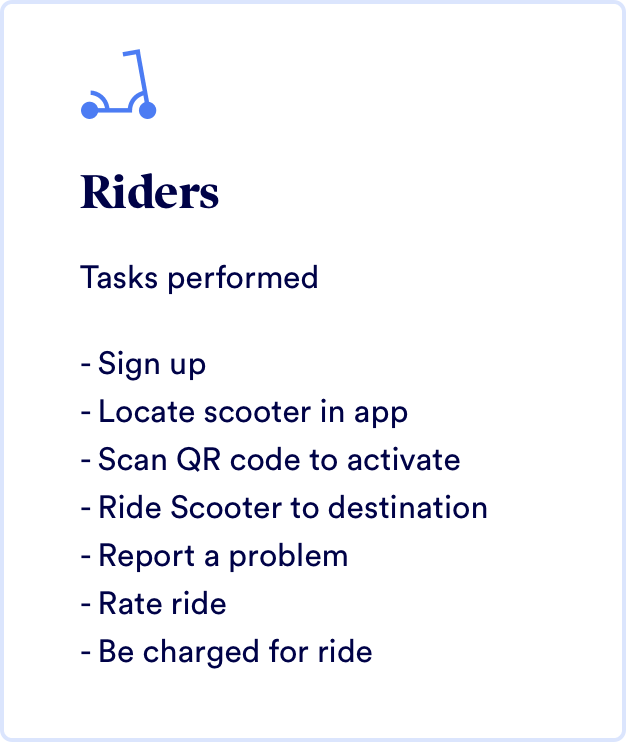
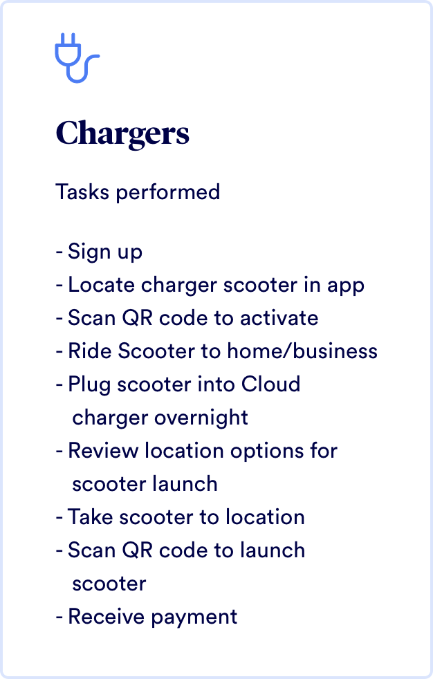
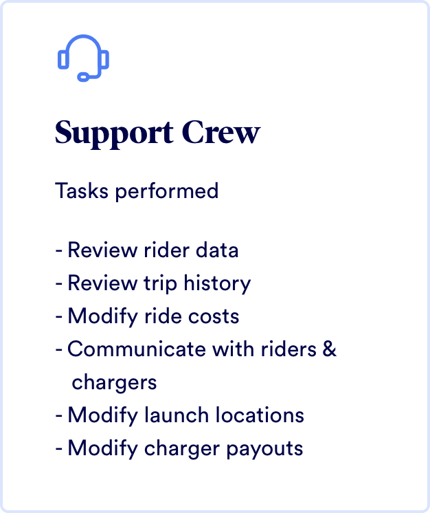
After conducting user interviews, contextual inquiry and analysing other competitors in the space, I broke down the users into these 3 categories and listed some of their tasks.
Marketing website
The marketing website was used to help secure funding, show off the capabilites of the scooters and suggest locations on where the scooters should be deployed next.
The solution
I created all the user flows and designs in Sketch, then did all the interactions and animations in Principle. This facilitated the development for the remote engineering team based in China.
Onboarding
Required by law, we had to explain best methods and practices for using a scooter. I wanted something enganging, fun and light.
Payment
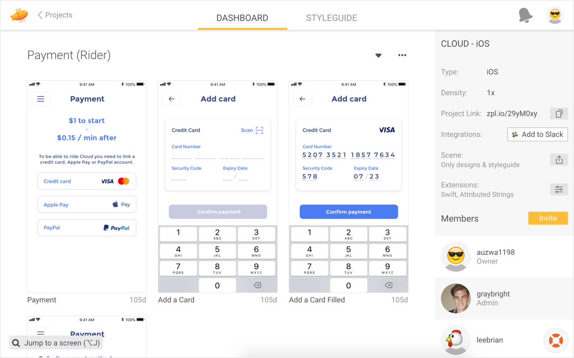
Payment is required before the first ride, but we didn't want the user to get frustrated or lose patience right at the start. Because of this, it was imperative that the payment flow was quick and easy to understand.
Ride
The riding interface needed to show the basics of battery level and location. We also introduced the ability to reserve a scooter, report a scooter problem and the ability to call a scooter.
Ride History
With the ride history, we introduced a map view to give a detailed look at when and where the user rode.
Charger
Chargers can also be riders, so we wanted to make the transition seamless. The location of the switch button was intentional as it is also a good CTA for any rider who might want to become a charger.
Design System
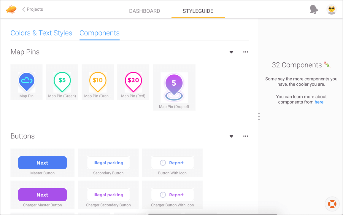
I wanted the UI to reflect the light and airy movements of riding a scooter with a futuristic touch. The bright colours were intended to separate Cloud from otherwise monochrome competition. Individual colours play an important role in the app design, signaling different scooter states and behaviors, and differentiating rider and charger actions.
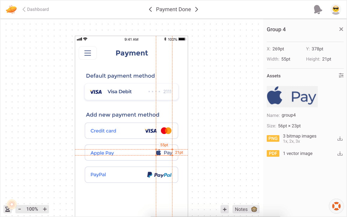
Having designed the flows in Sketch, I used Zeplin to house and share the assets. This kept the engineers who were based overseas and working different time zones up to date with any changes, and gave them the resources to make informed decisions without having to wait.
For the design system and styleguide I used Zeplin, I was able to house and share these screens with all stakeholders and engineers, especially handy when working with engineers who were based overseas working different hours.
Let's chat!
Currently open to new opportunities remote or in New York
