Olark
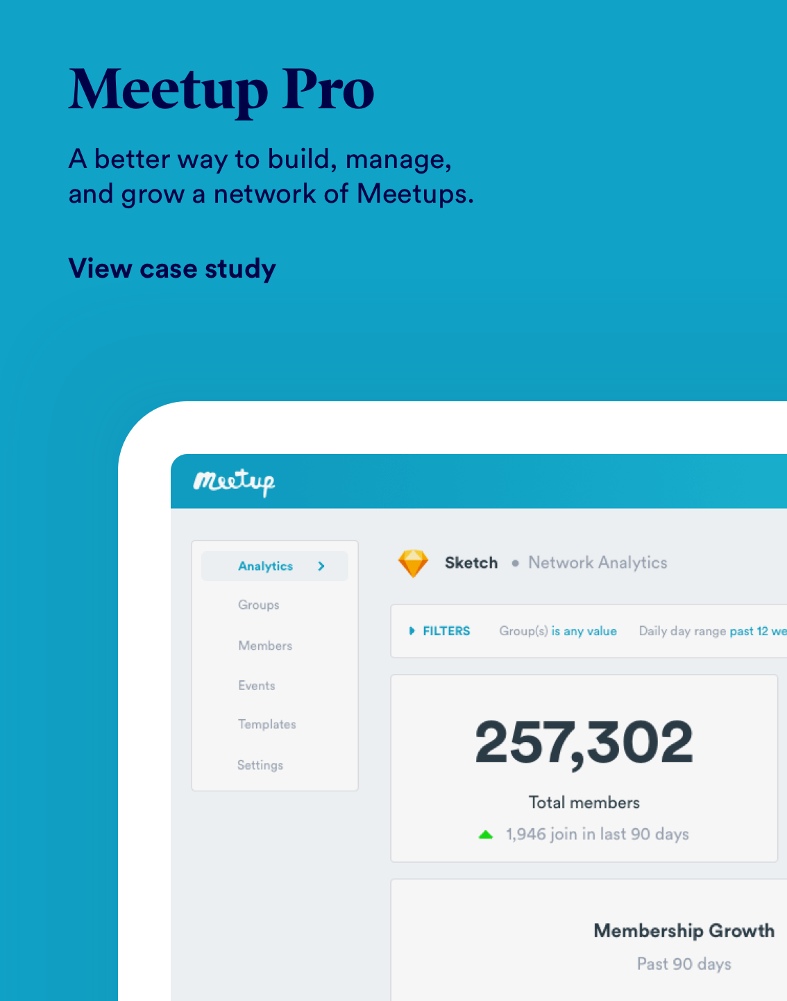
Meetup Pro
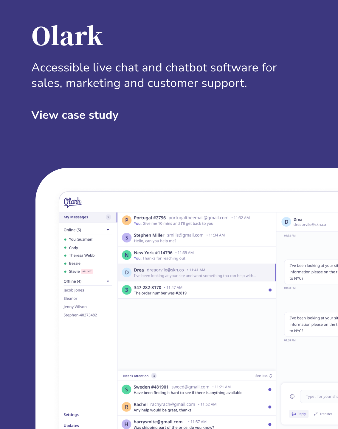
Accessible live chat and chatbot software for sales, marketing and customer support.
OVERVIEW
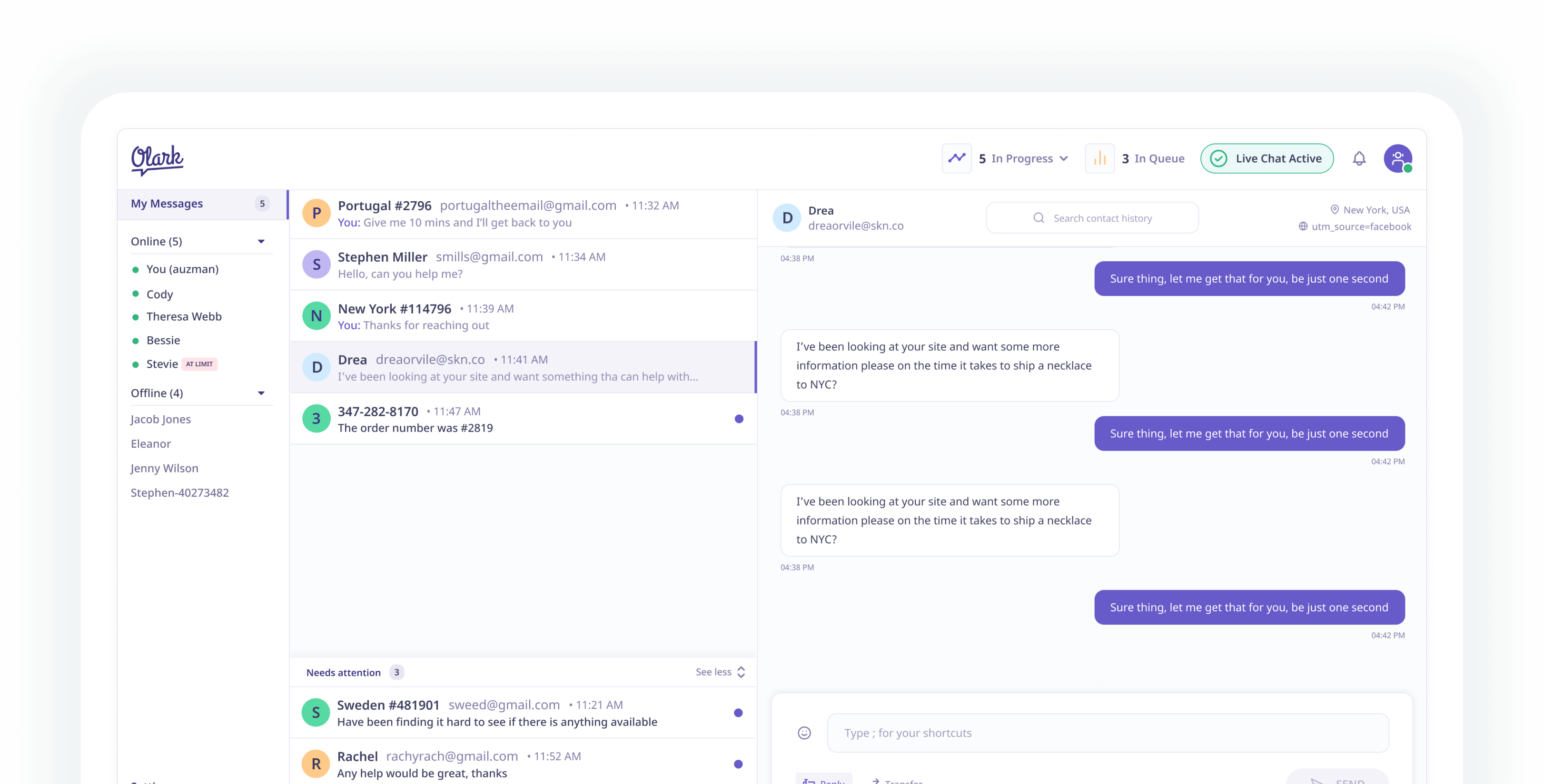
Olark helps companies track leads, drive sales, increase conversions, and provide great customer service. Real-time visitor information like login name, geographic location, purchase history and cart contents help companies personalize every interaction and strengthen customer relationships. Over the course of a few months I worked alongside their internal product & engineering team to develop a new design language, user interface and user experience.
Meetup Pro connects brands and businesses to their audiences in real life, driving community growth, customer engagement, and brand awareness. By tapping into the huge amount of data within the Meetup platform we wanted to create a product that could be a new revenue driver for the company whilst helping community managers and companies achieve their goals.
ROLE
Lead Product Designer
Illustrations, Information Architecture, Interaction, Visual design & Design systems
1 Designer, 1 Product Manager, 4 Engineers
The Problem
Olark has been around for nearly a decade and in that time, the user interface of it's client facing product has not changed. They were facing competition from larger players in the market like Hubspot, Intercom and Salesforce but knew that had a product that their customers loved. There was an opportunity to revamp their visual look and feel and integrate that alongside some of their smart machine learning capabilities the engineering teams were building out.
Data has never been a strong point for Meetup at the consumer level: in the backend there is a heap going on to serve the right members to the right groups millions of times a day, but there has never been a way for organisers of large networks and companies to delve into that data and control how they want to use that it. Community Organisers are leveraging the power of community to drive real impact at their place of work and Meetup is well positoned to be the leader in this space.
What needed to change?
Customer interviews?
What are we going to build?
The research we conducted helped me understand some key insights relating to how Olark is perceived and used.
- A dated look at that didn't sit well with the suite of Olark products.
- A clunky UX that confused new hires (Onboarding for the application took ages, was a steep learning curve.)
- Customers where looking at other products to achieve similar results.
- Wasn't compatible with Mac.
- Key actions were often buried under layers of buttons and sub menus.
- Was slow which cost precious time.
Trial & Error
We took our learnings and began to play around with the UX of how our customers would interact with the product. I would build these out in ProtoPie then work with the Product Manager to get these designs into customers hands for real time feedback.
Data has never been a strong point for Meetup at the consumer level: in the backend there is a heap going on to serve the right members to the right groups millions of times a day, but there has never been a way for organisers of large networks and companies to delve into that data and control how they want to use that it. Community Organisers are leveraging the power of community to drive real impact at their place of work and Meetup is well positoned to be the leader in this space.
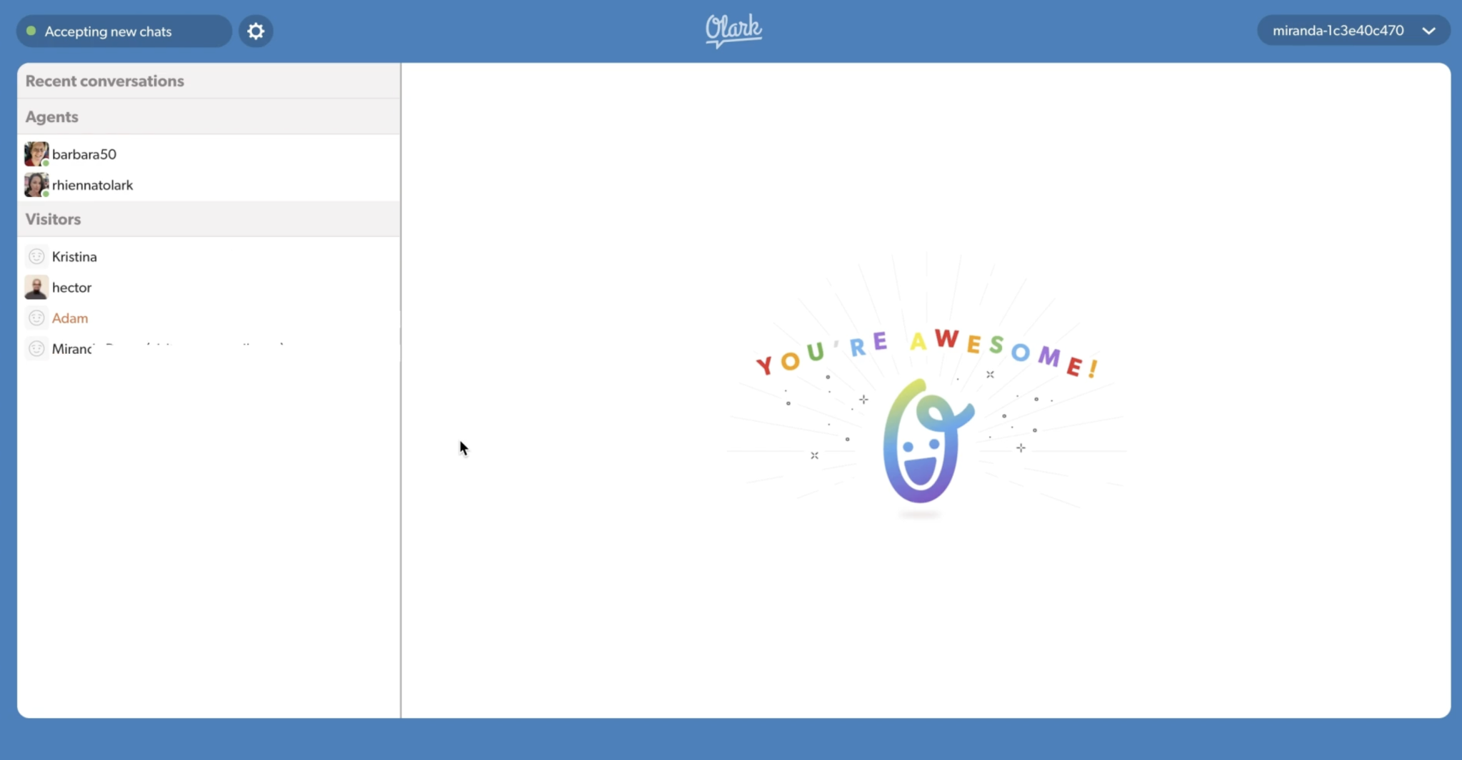
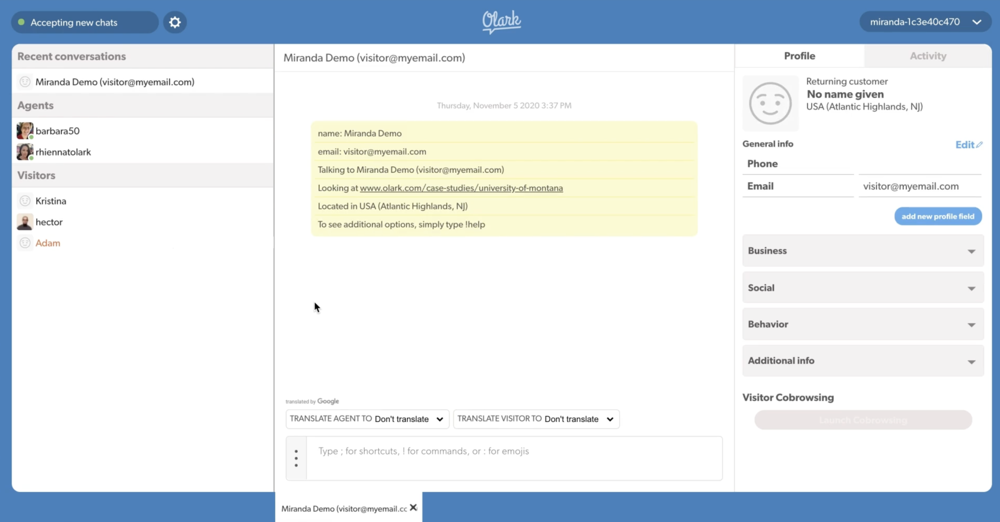
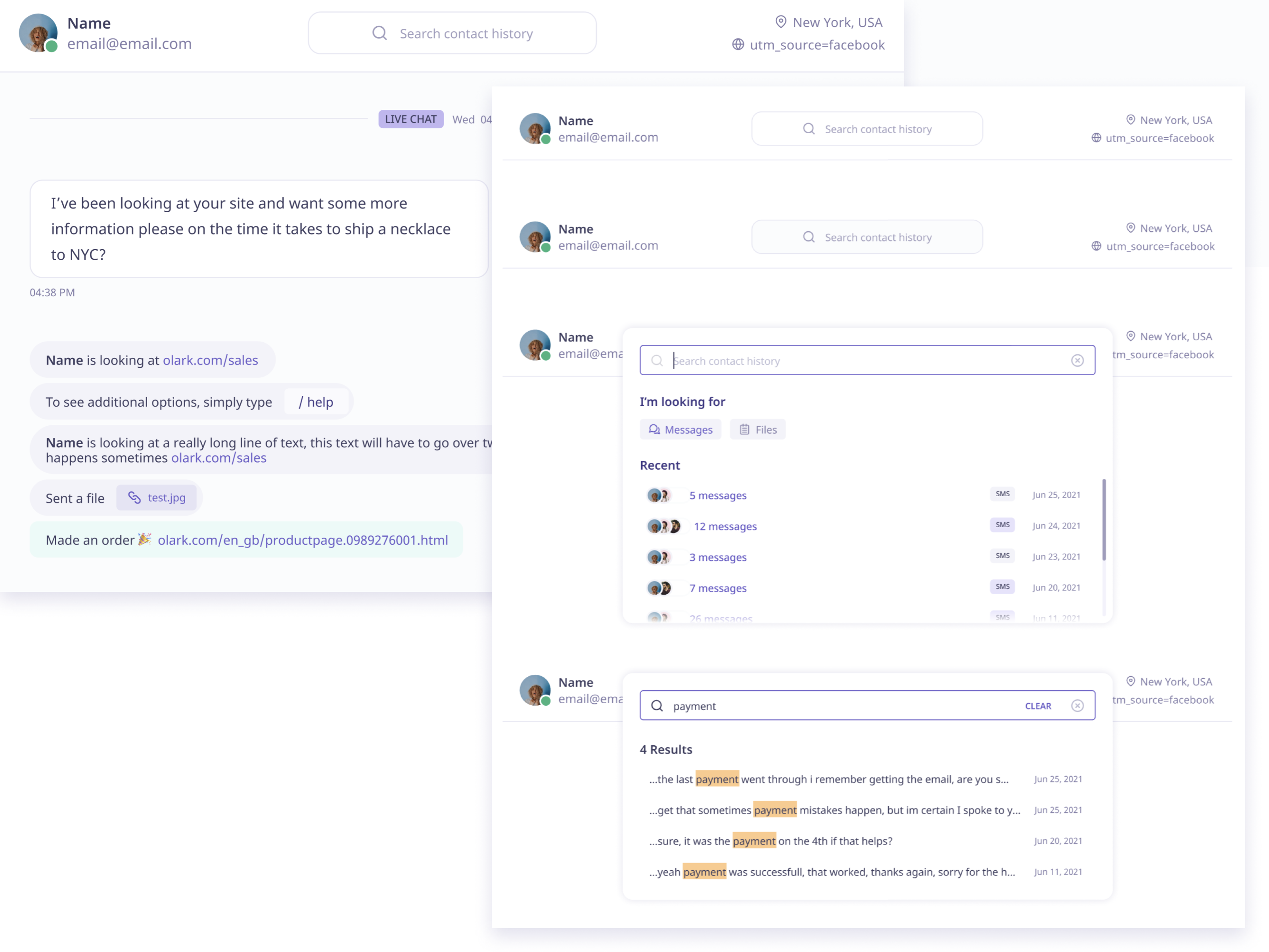
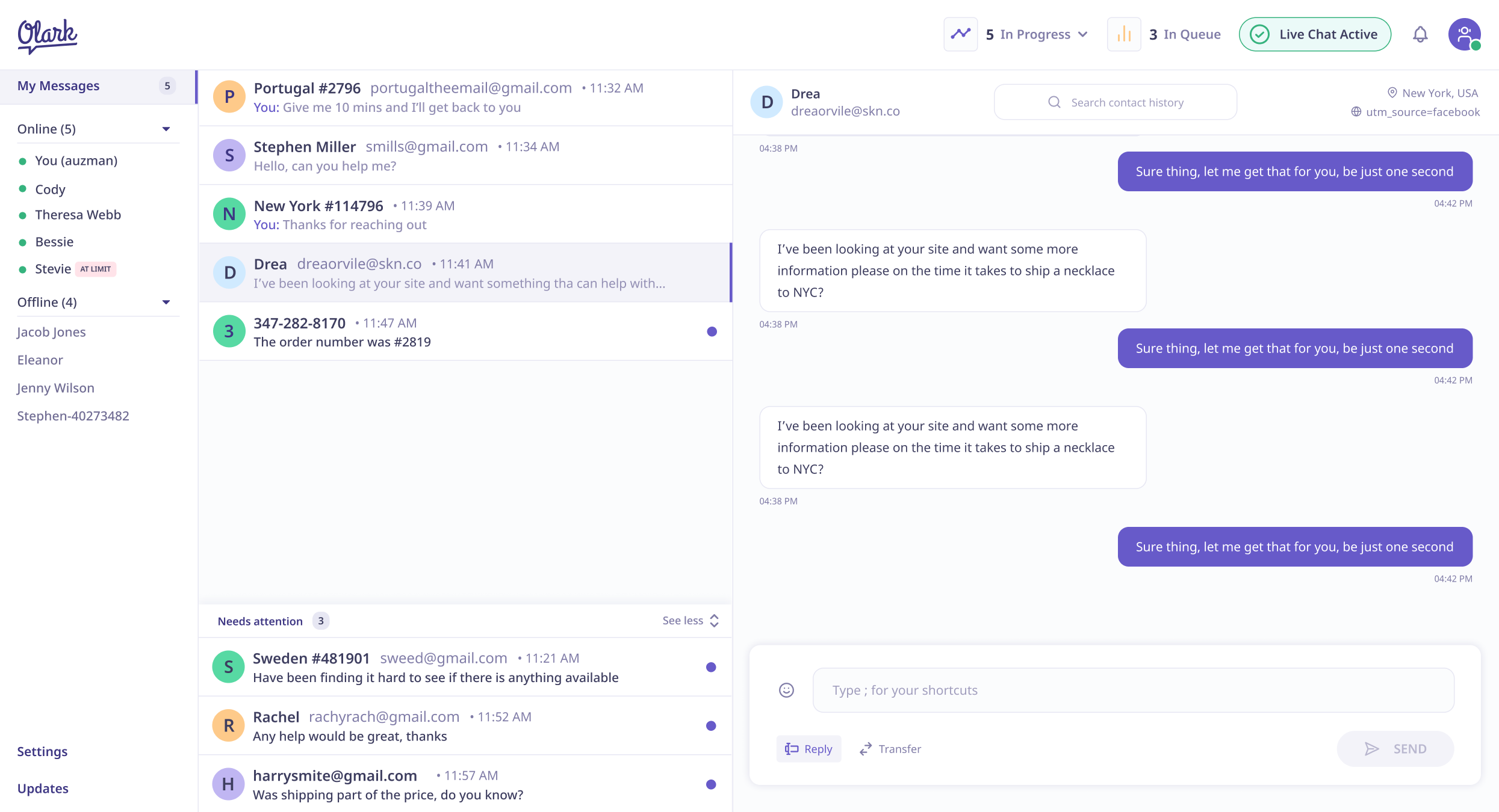
This prototype is looking at how customers would view new contacts and interact with them.
Data has never been a strong point for Meetup at the consumer level: in the backend there is a heap going on to serve the right members to the right groups millions of times a day, but there has never been a way for organisers of large networks and companies to delve into that data and control how they want to use that it. Community Organisers are leveraging the power of community to drive real impact at their place of work and Meetup is well positoned to be the leader in this space.
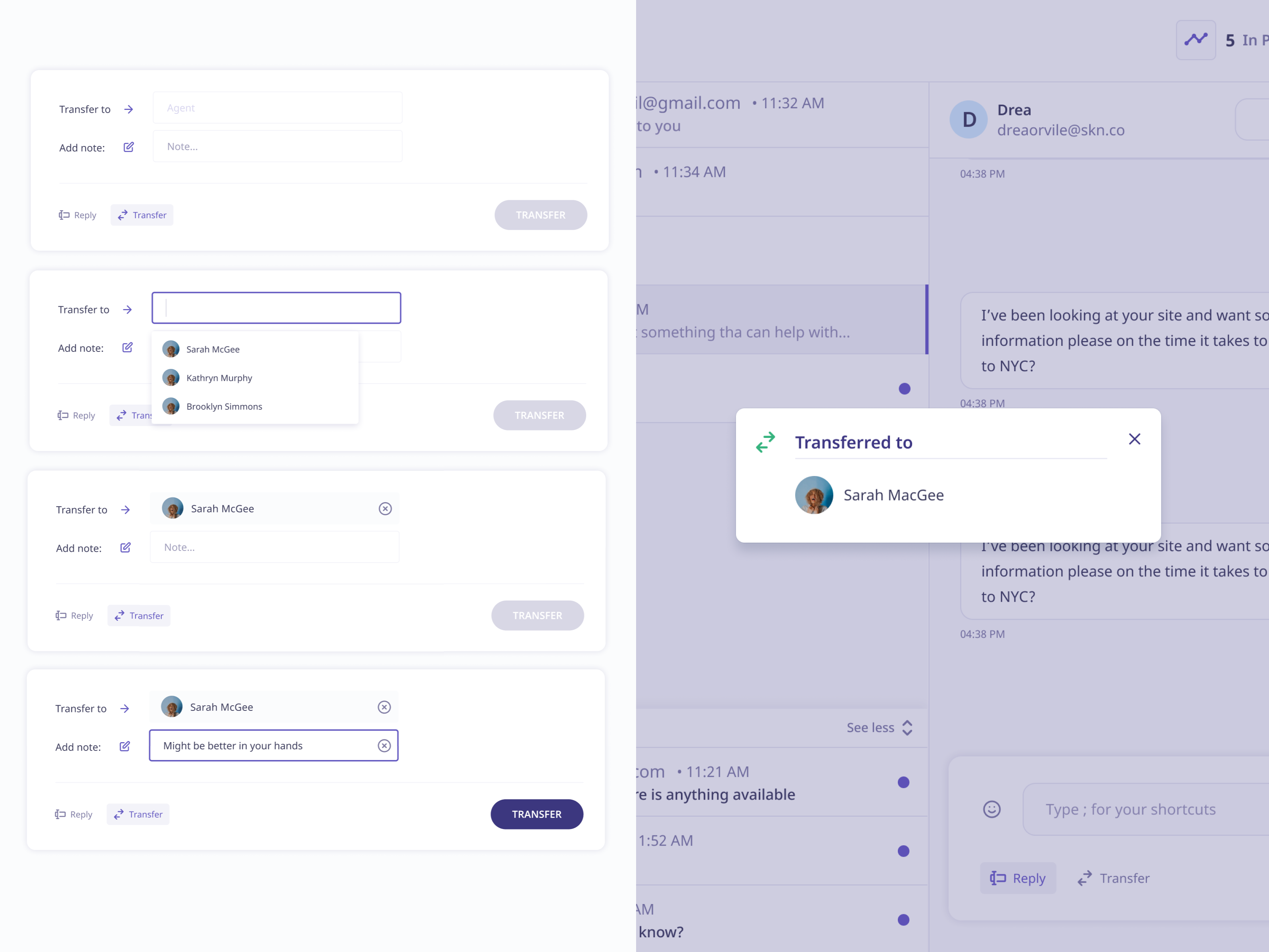
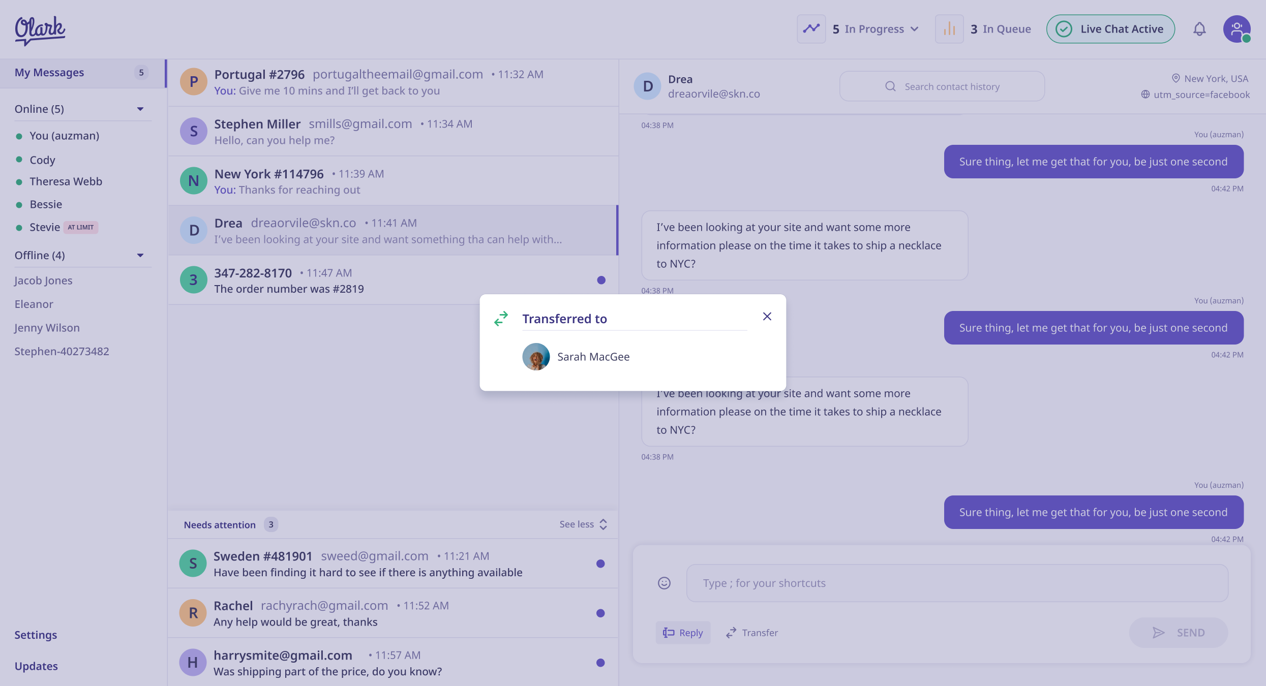
This prototype was more focused on some larger UX issues around the main navigation & agent transfer system.
Data has never been a strong point for Meetup at the consumer level: in the backend there is a heap going on to serve the right members to the right groups millions of times a day, but there has never been a way for organisers of large networks and companies to delve into that data and control how they want to use that it. Community Organisers are leveraging the power of community to drive real impact at their place of work and Meetup is well positoned to be the leader in this space.
Design System
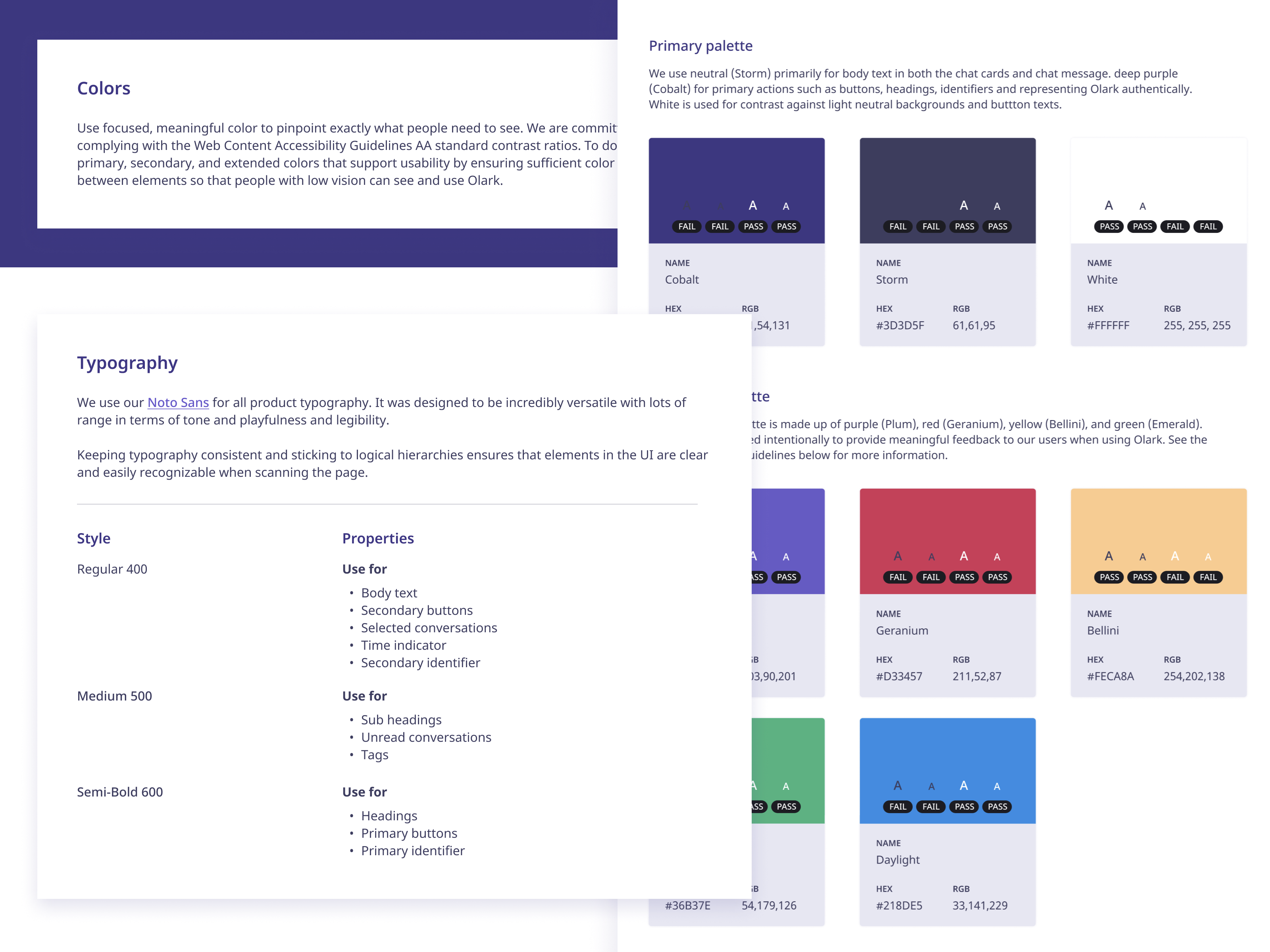
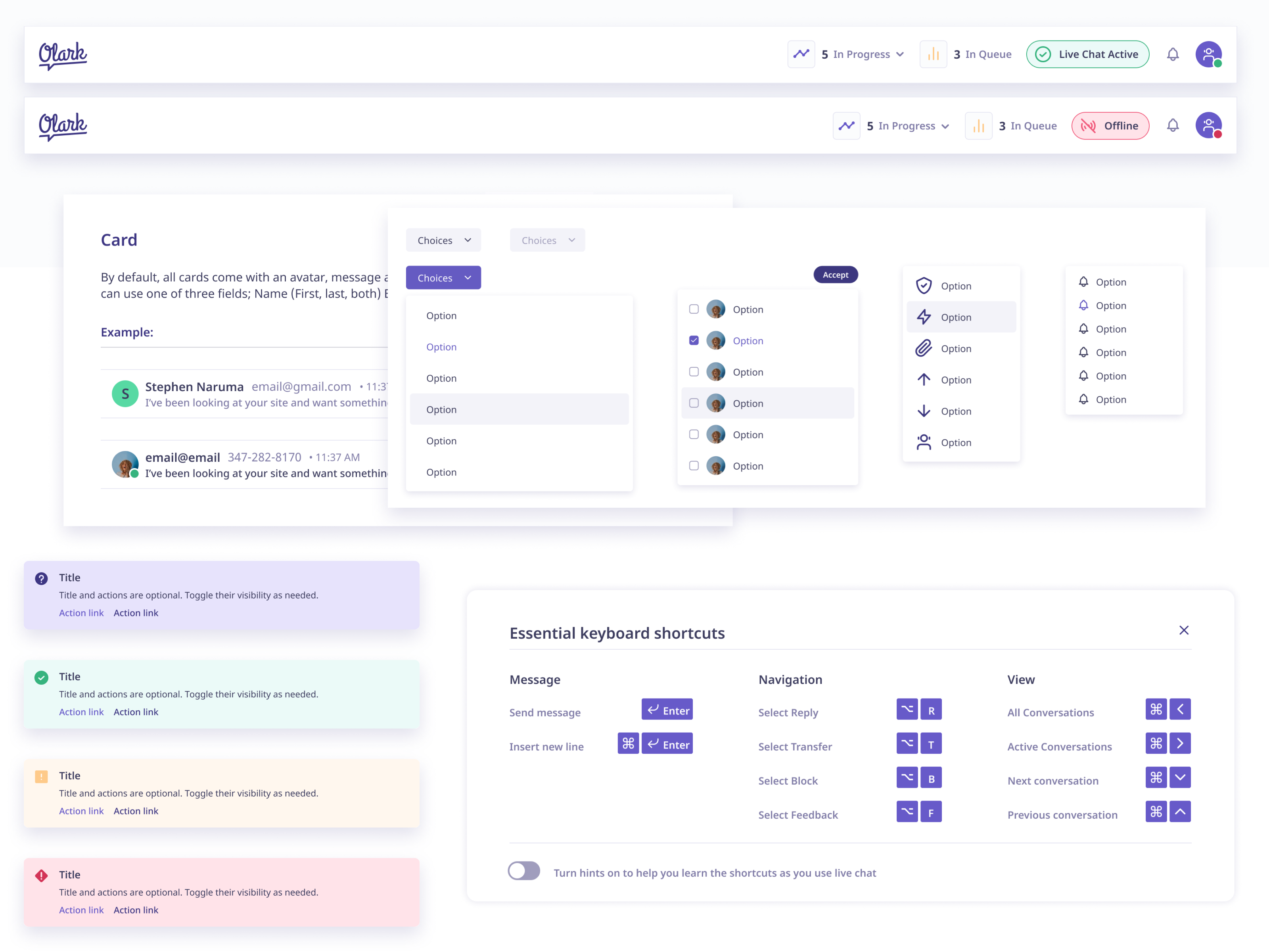
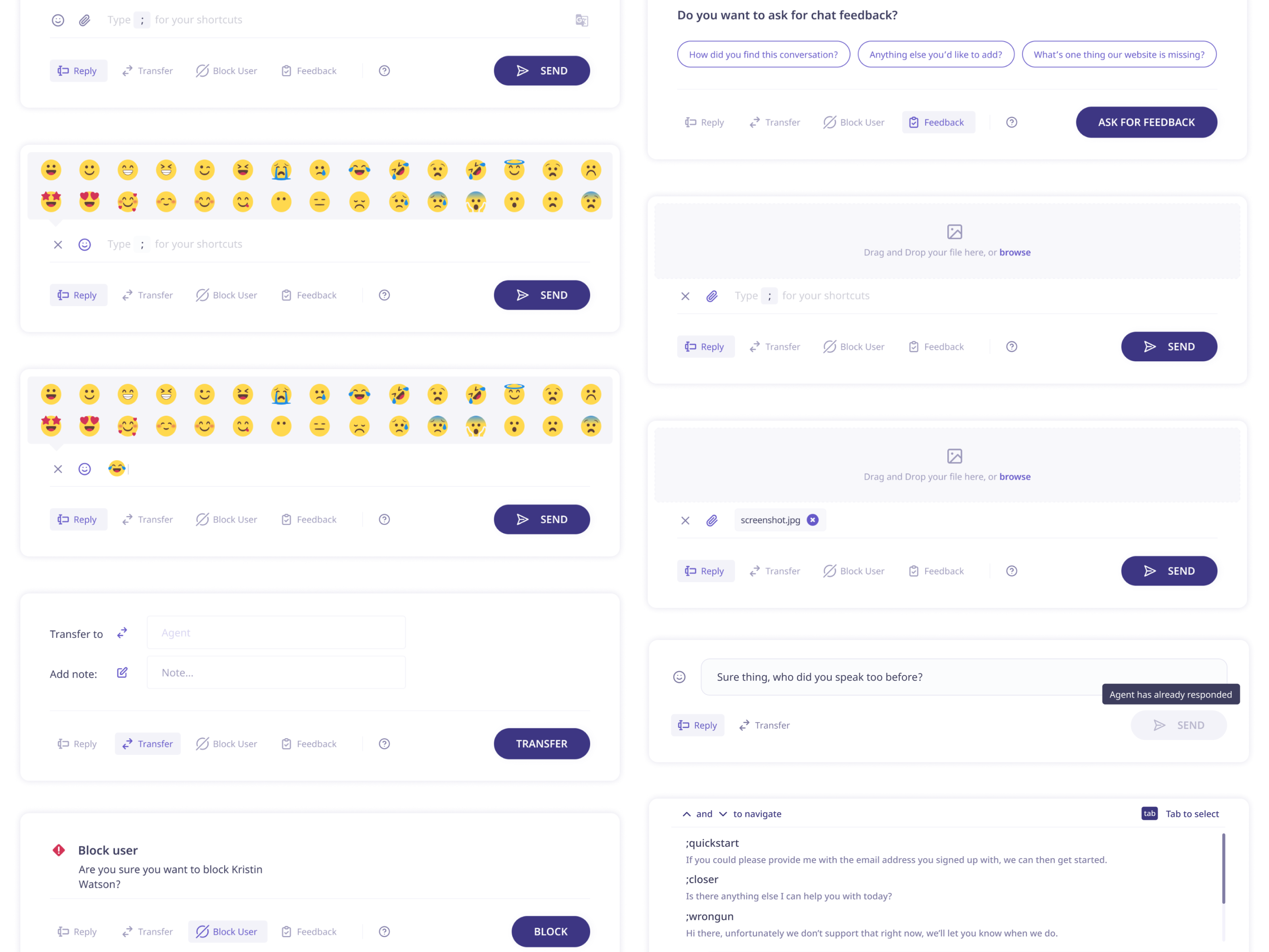
Alongside the prototypes I was developing the design system which would underpin the whole project. Using Figma & ProtoPie in tandem allowed me to work quickly and update the project in real time. Towards the end of the project I worked with the engineers to build out the design system in CSS.
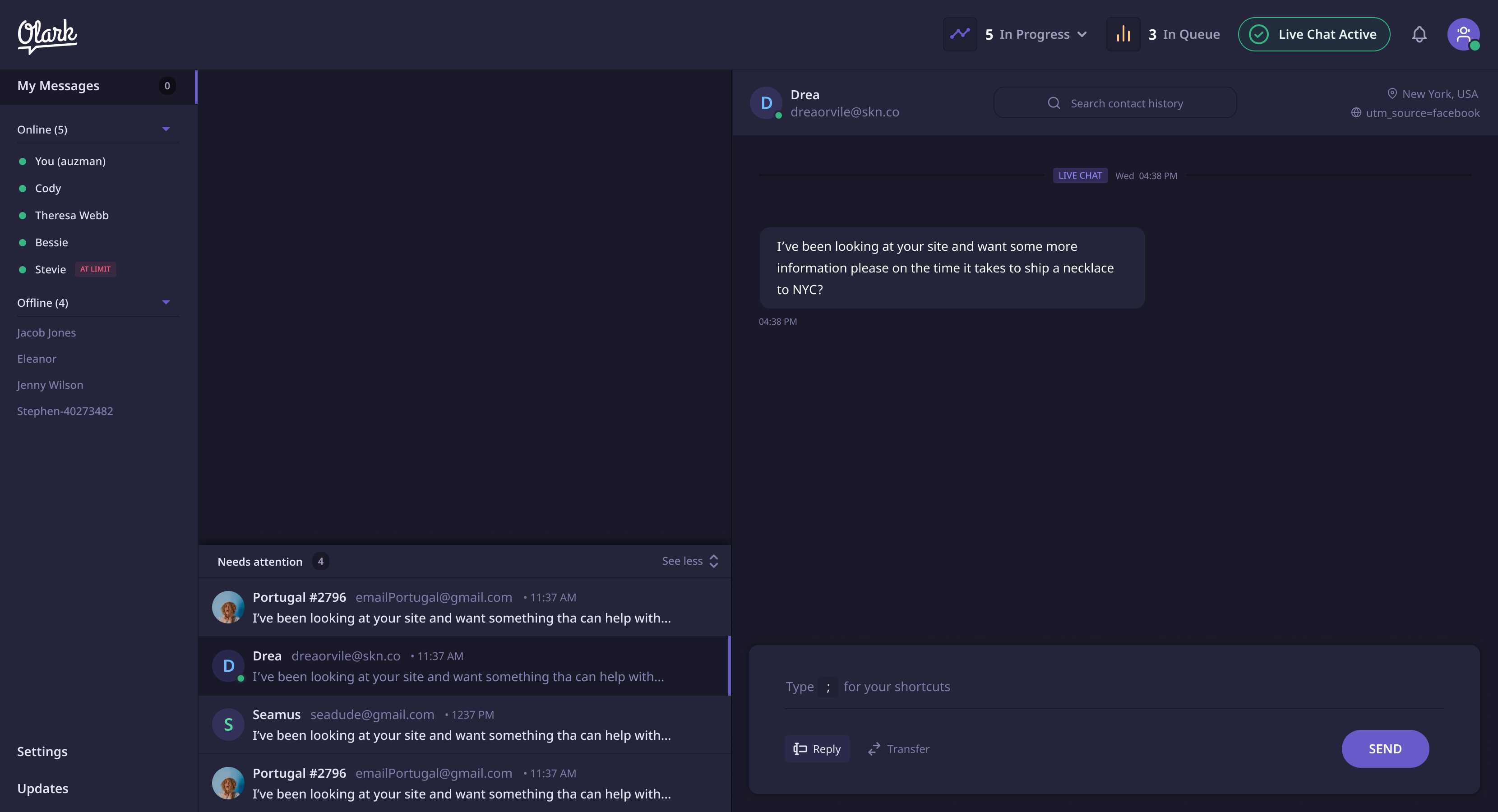
Dark Mode Exploration
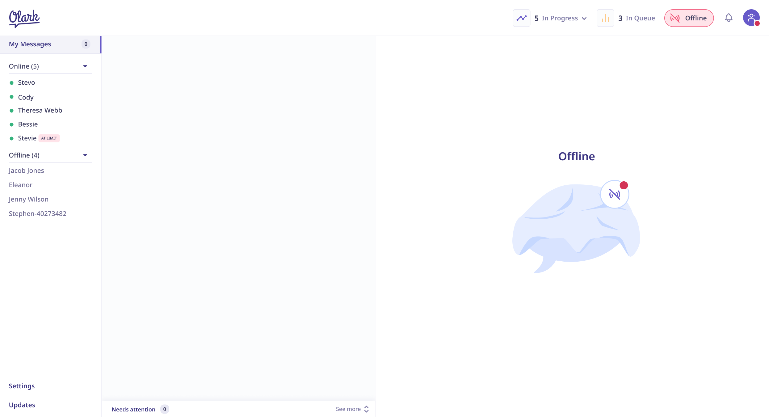
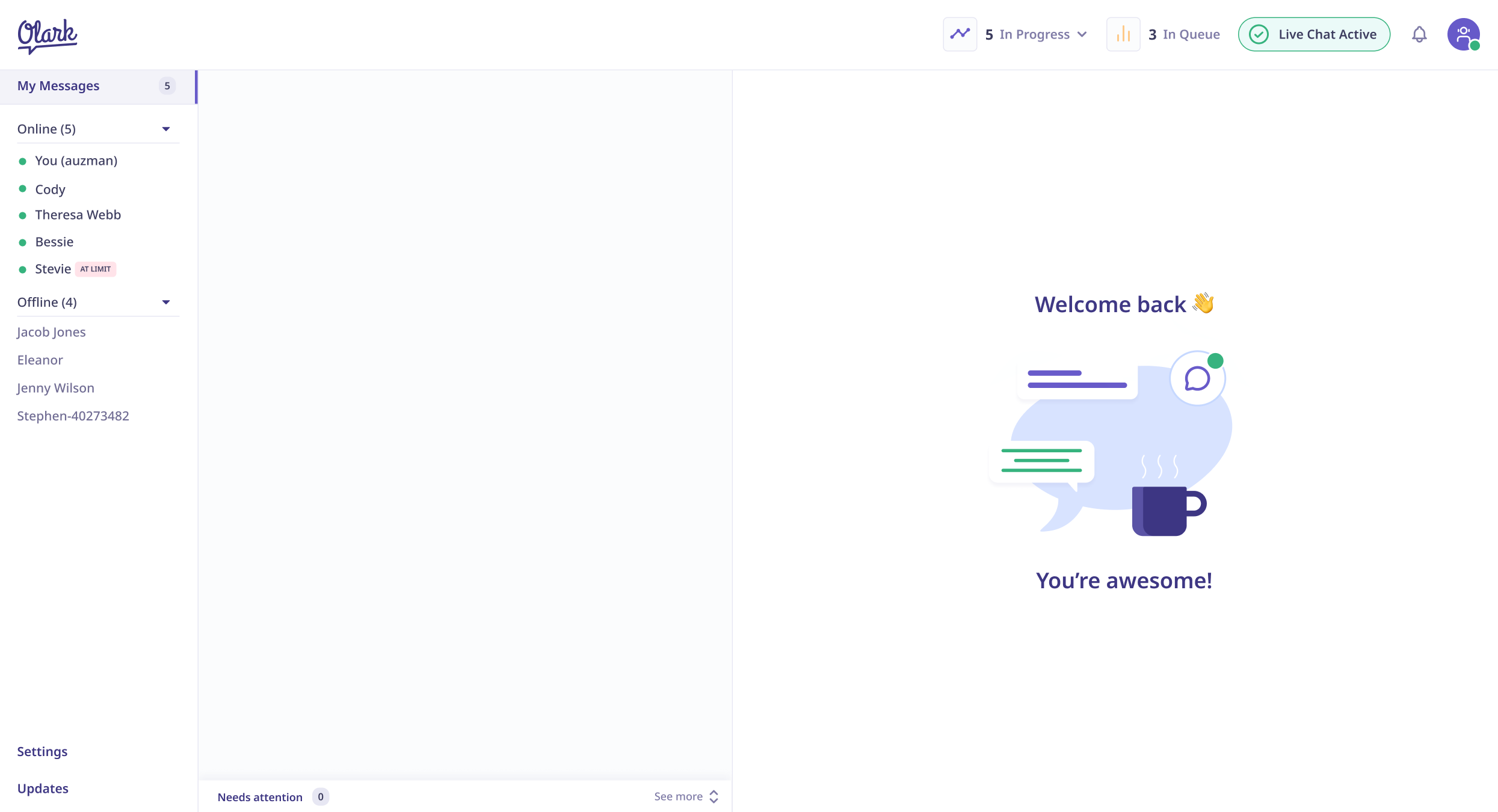
Empty States
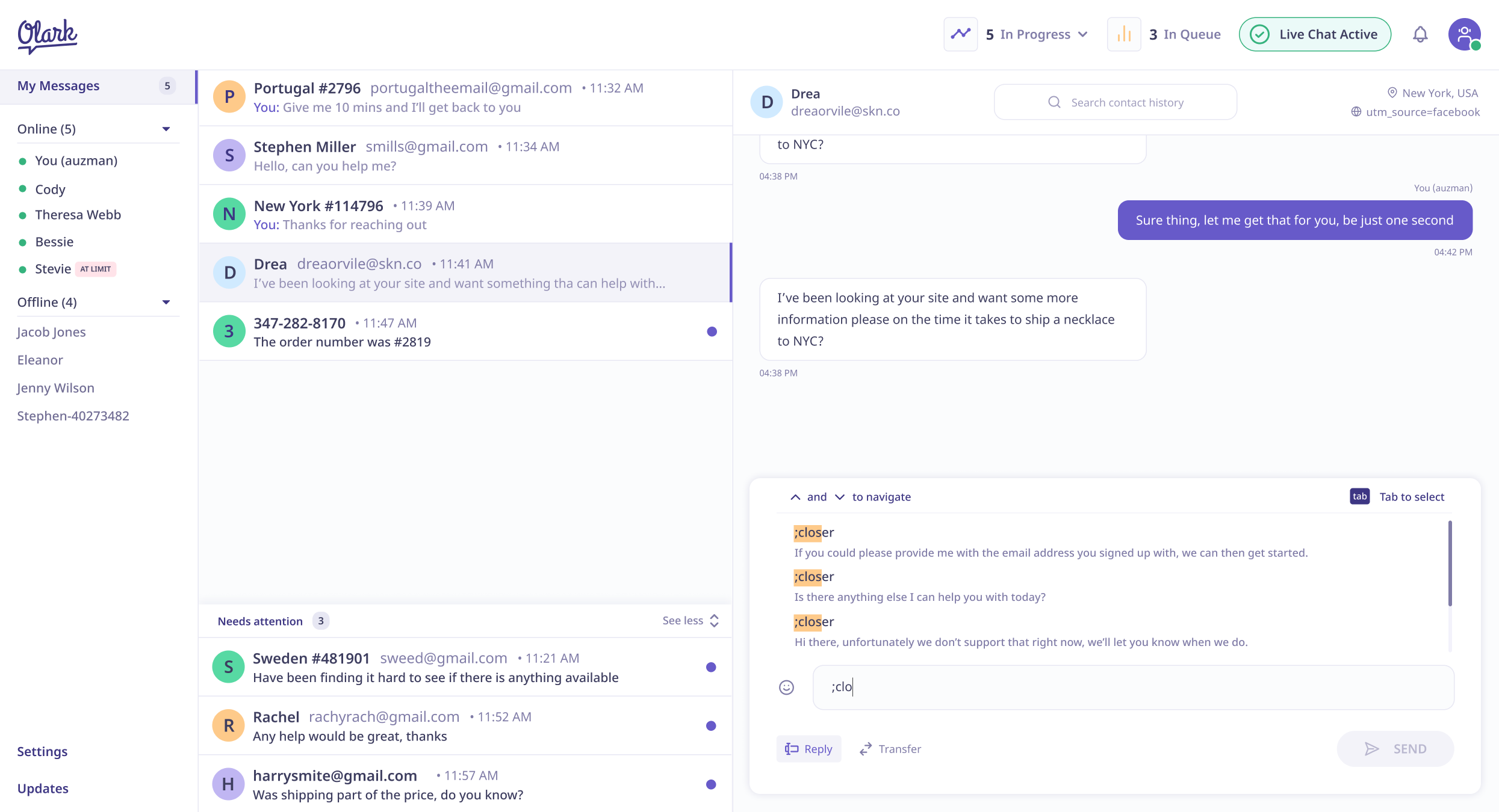
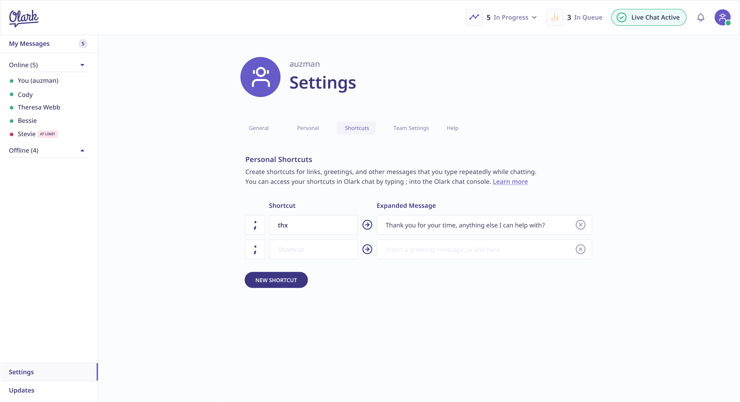
Shortcuts

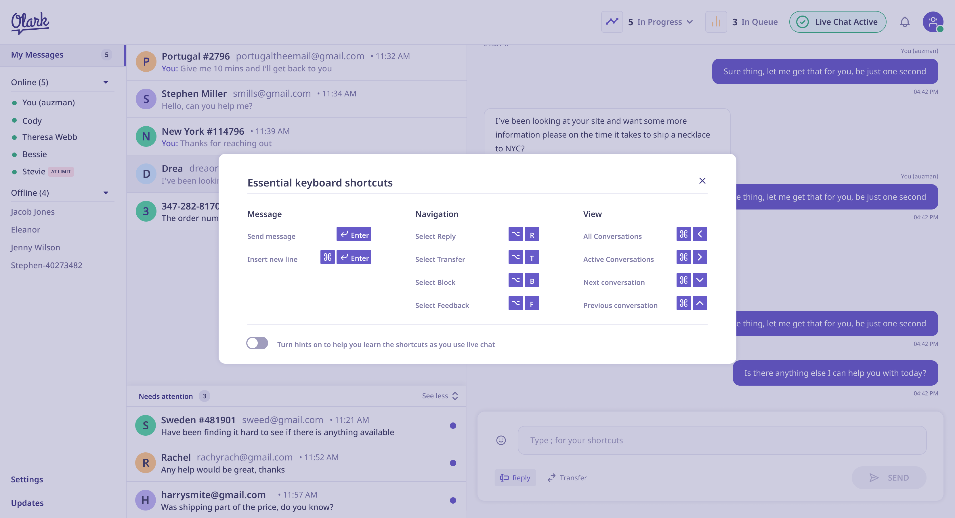
Agent Transfer
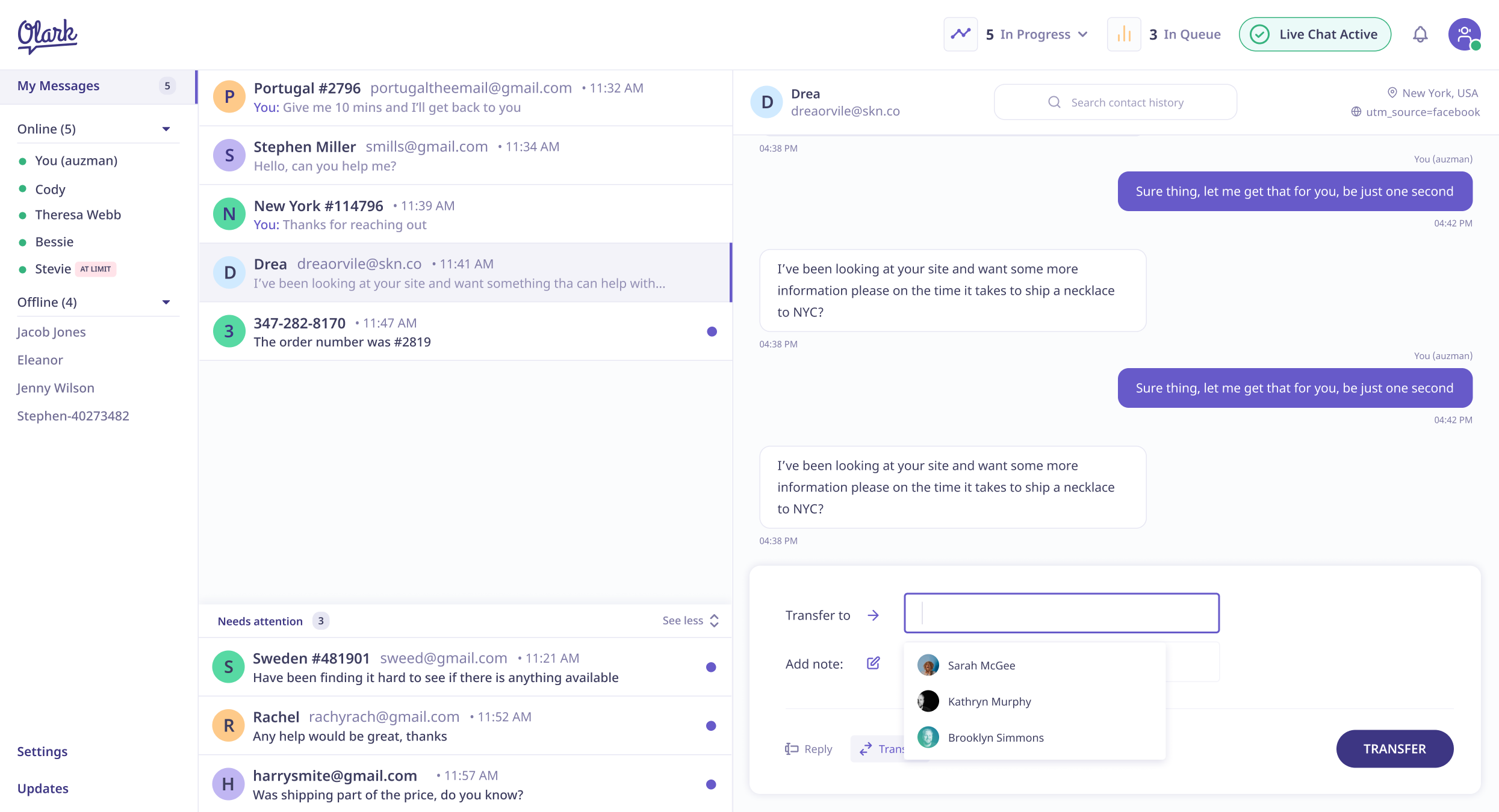
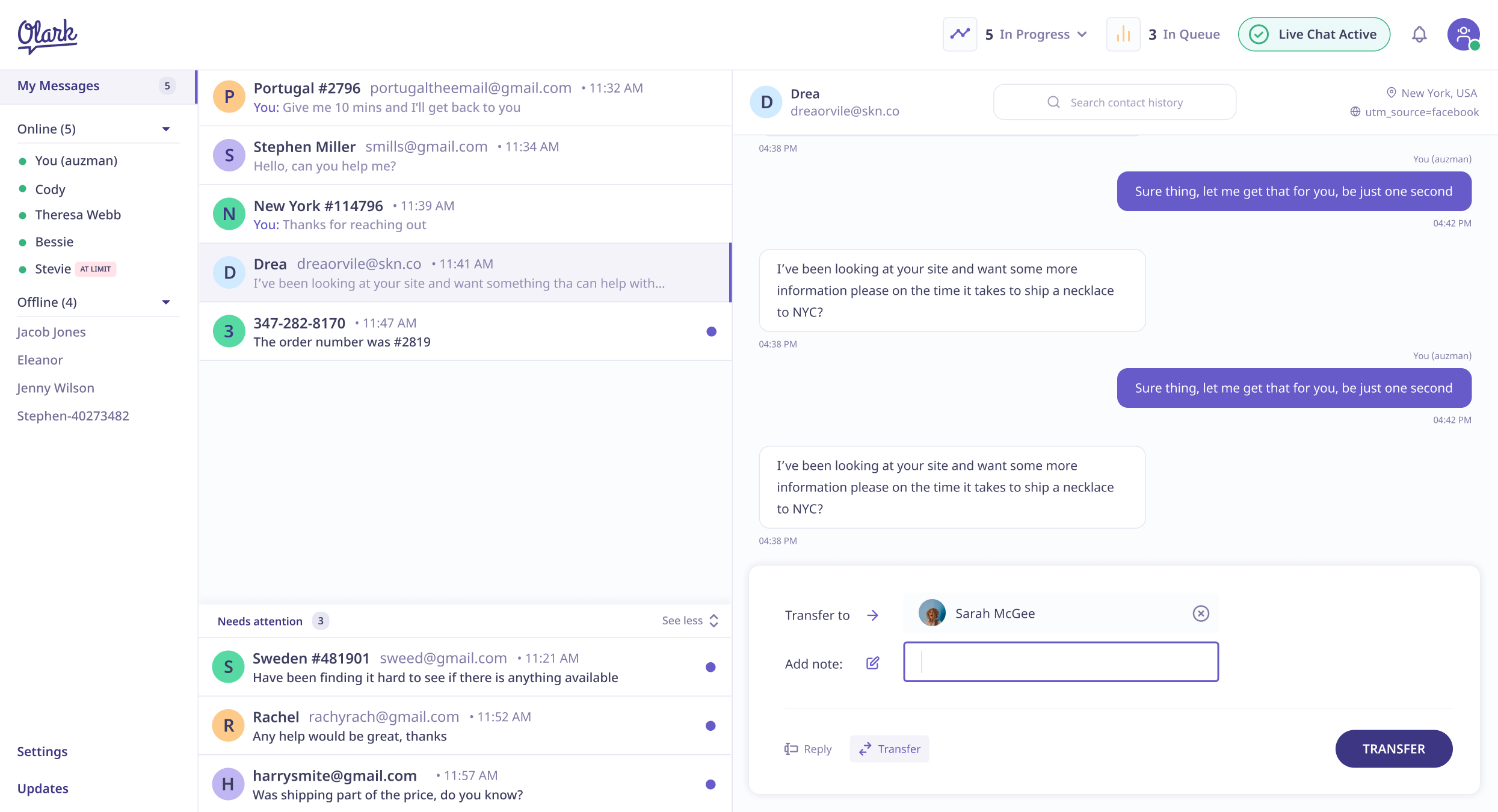
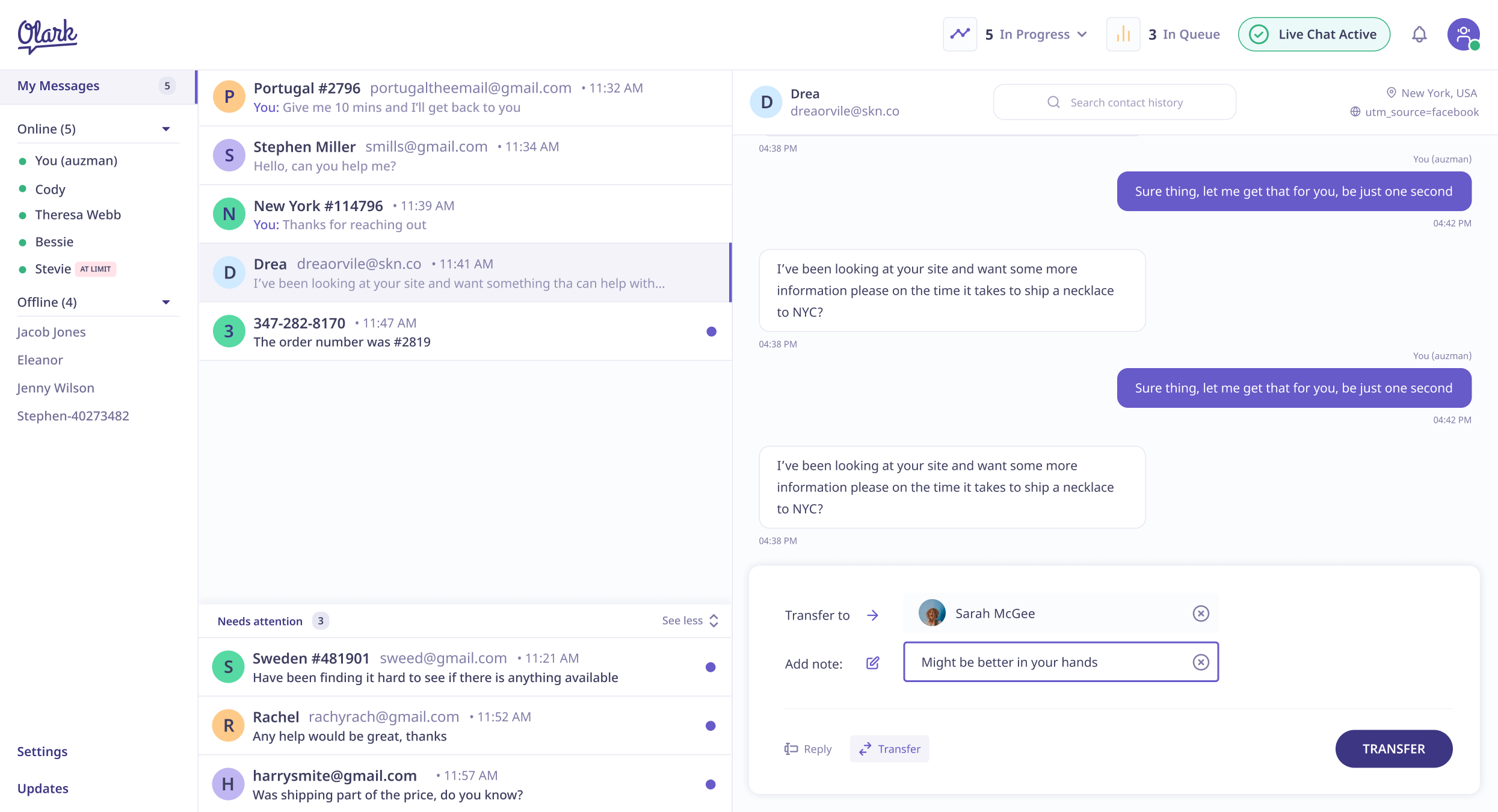
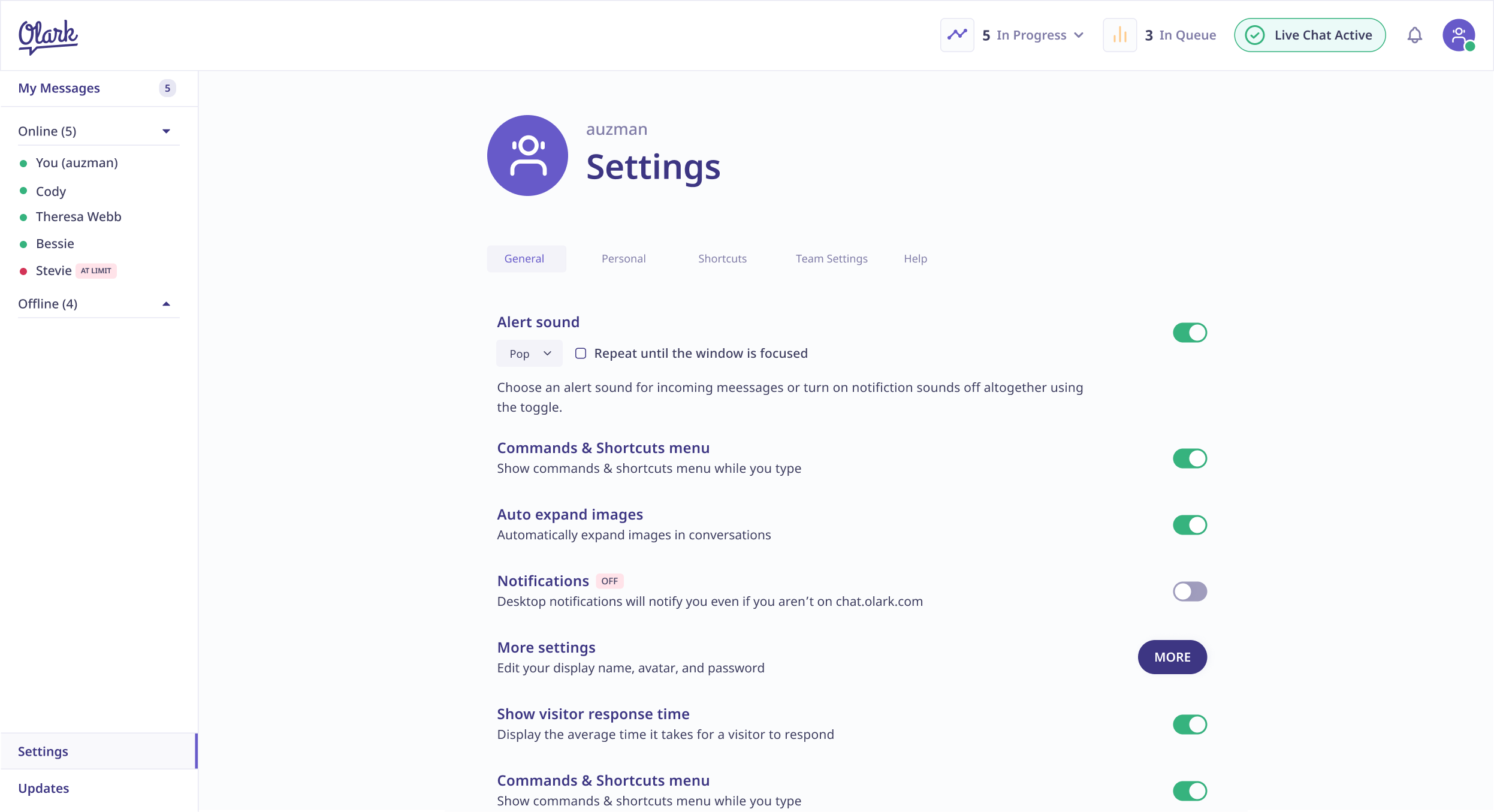
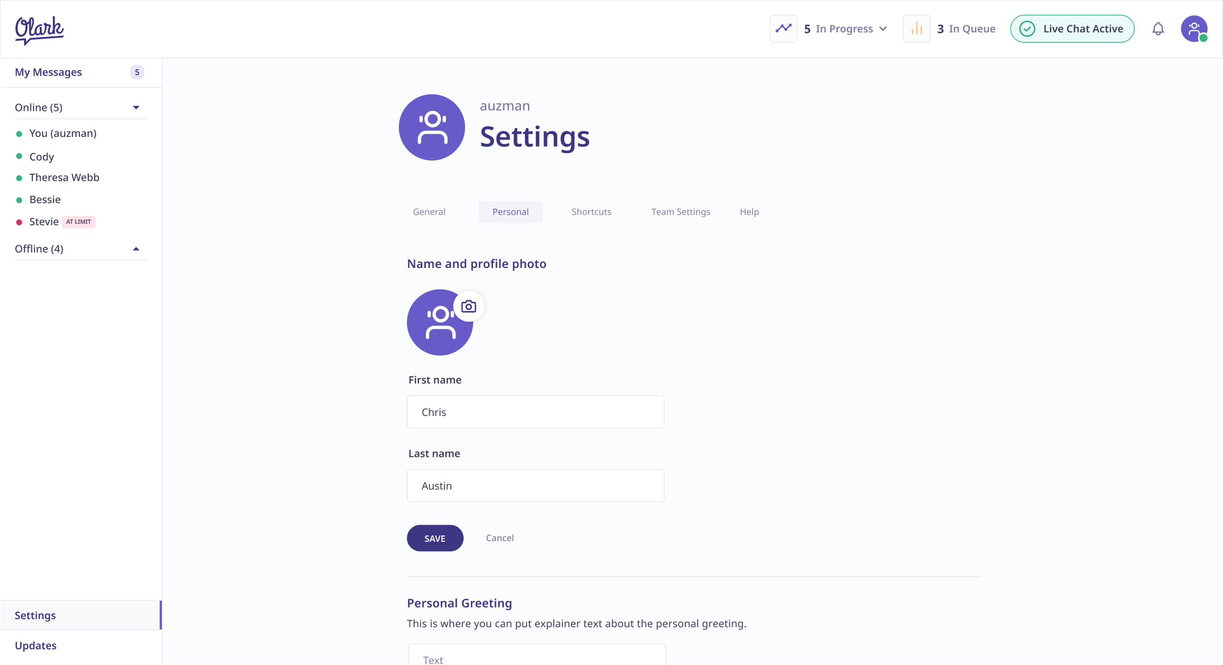
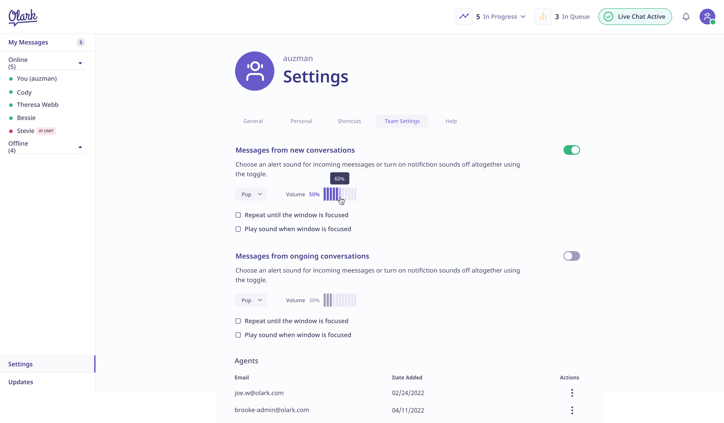
Settings
Let's chat!
Currently open to new opportunities remote or in New York
