realestate.com.au
realestate.com.au
From mobile site to Android app in 10 months, Australia lives here
OVERVIEW
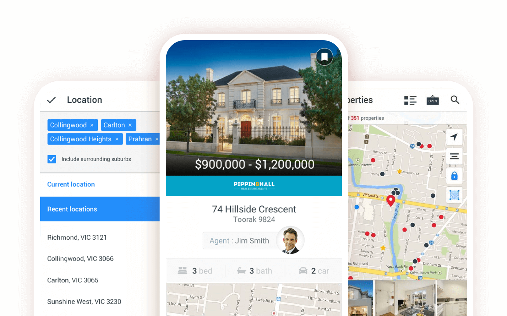
In Australia, REA Group's residential property platform realestate.com.au, is the country’s leading place for property, news and inspiration. With this in mind we knew we had to do better than the mobile web wrapper that we were offering in the Android Play Store. I led the initial idea to form a team to reimagine what the app could be like using Material Design as our base and give the 3 million Android users an app they deserve.
ROLE & DURATION
Lead Product Designer
Lead Product Designer
Research, Interaction, Visual design
1 Designer, 1 Product Manager, 1 Technical Lead, 5 Engineers
The Problem
The Problem
Being Australia’s largest real estate portal, we had a duty to our consumers and customers to deliver a world-best native Android solution. The Play Store rating was at an abysmal 2.2 star rating, consumer confidence in the product was low and advertisers did not want to support the platform. The mobile web wrapper that was in place was slow and buggy, the design language was not up to date with our brand and we were missing out on providing a feature rich experience. We needed to turn this around and make the Android experience a first class citizen within our suite of products.
Getting started
The project kicked off with a 1 week product workshop where we introduced the new members of the team to what we were planning on building. Throughout the week we had people from the data, product, strategy and design teams come together to help define our users, uncover any possible new features and understand the business case for doing this work. We also held a workshop with the iOS team where we looked at where we could leverage the learnings from the current iOS app. We asked ourselves certain questions to help steer us in the right direction such as:
- How and why do people use our product?
- What are the pain points or bottlenecks we currently have?
- What are the business goals?
- What do we want in our MVP?
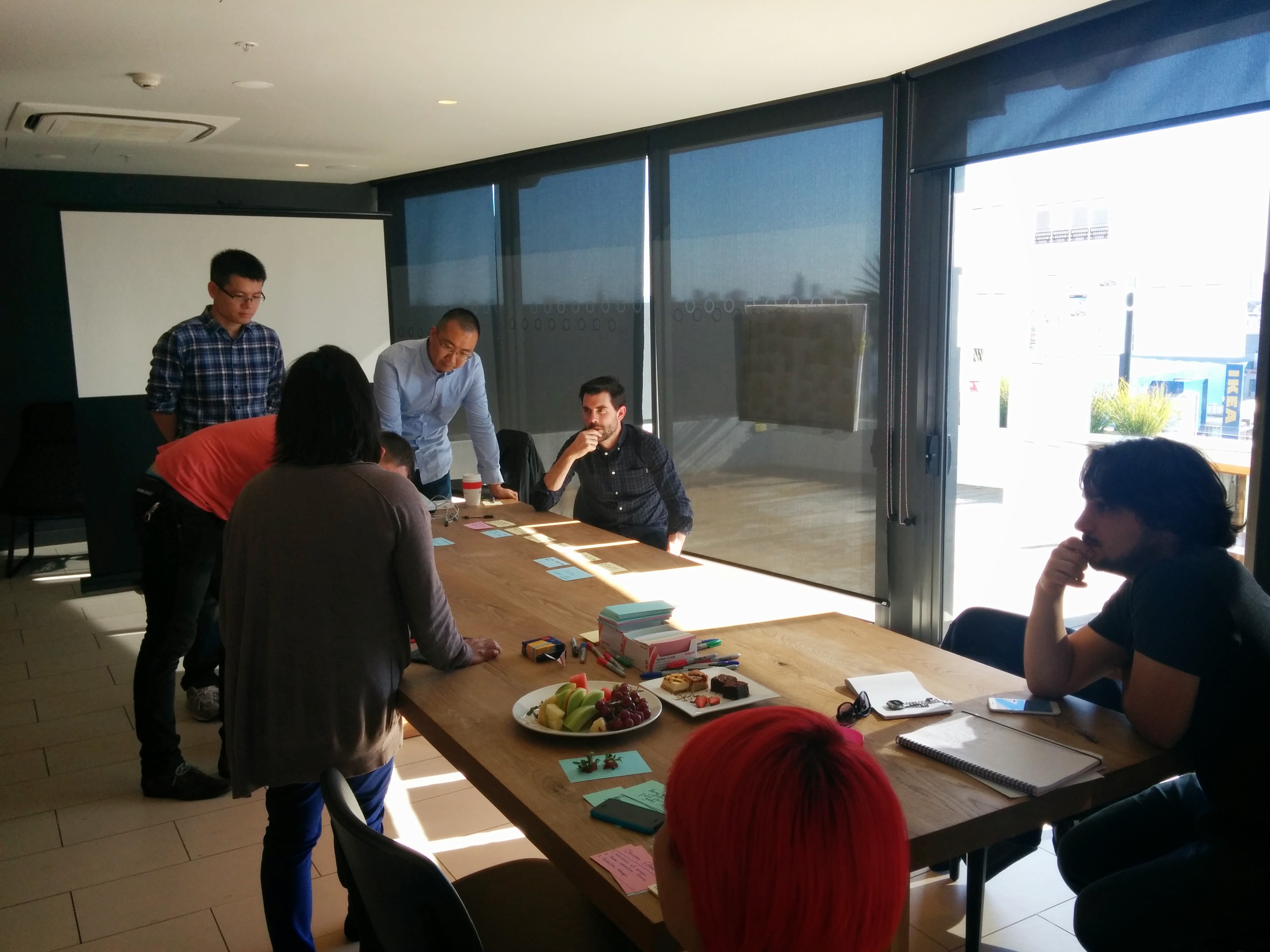
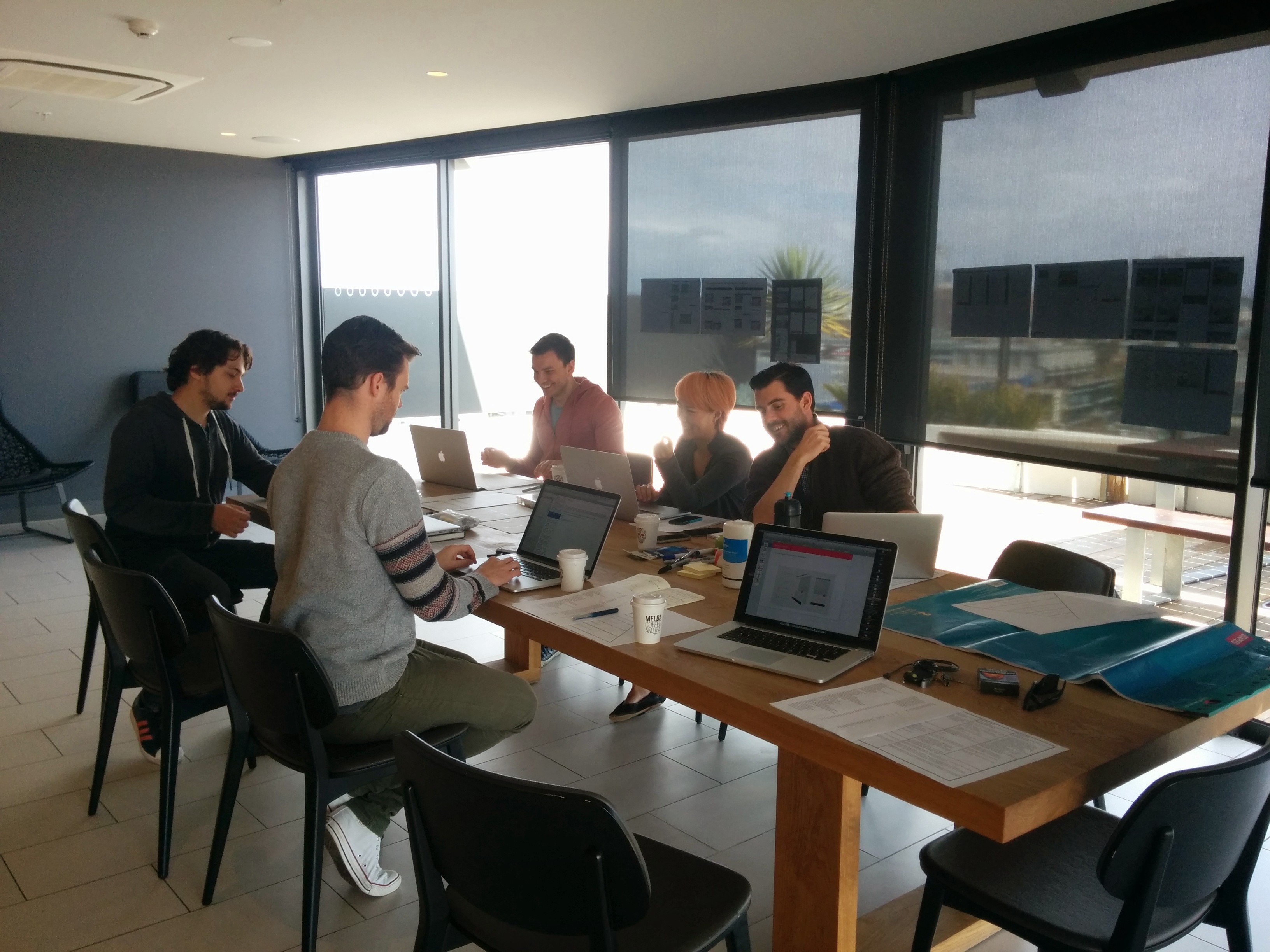
Fig: Pictures from the workshop
Who are we designing for?
Who are designing for?
During this discovery phase, our strategy team worked through the numbers and provided us with insights into our users. Although we had thought the renters and buyers would be the biggest user base, we were surprised to find out that the "dreamers", people who just browse for fun, came out on top. We would use this information to help shape the UI of the project.
User Flows
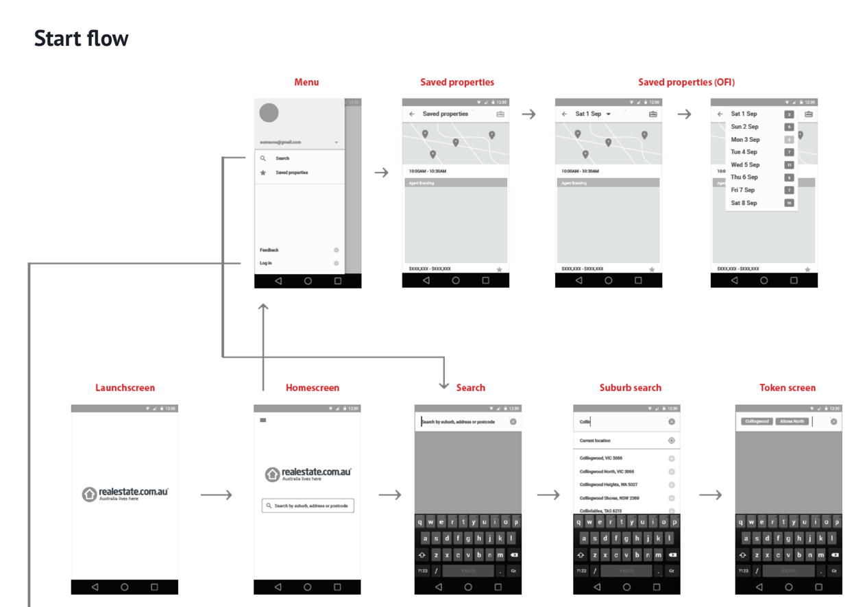
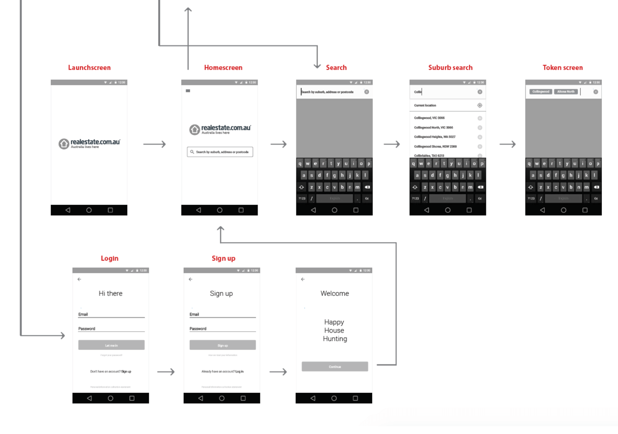
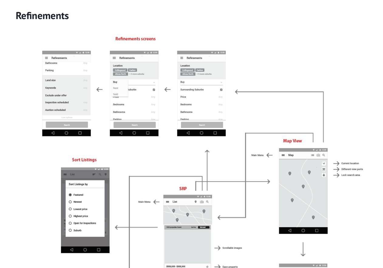
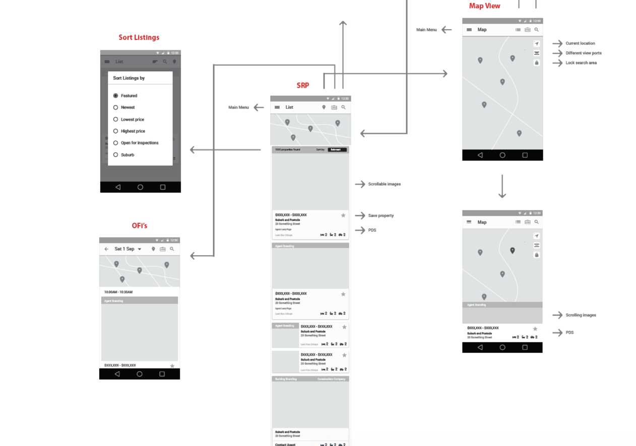
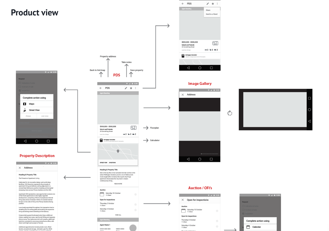
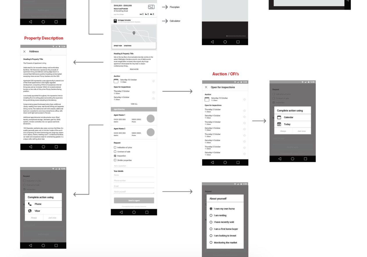
Using the insights we had gathered from the workshop, I started creating the low-fi concepts for primary use cases.
I had the basic UX of the core screens somewhat sorted as we had the iOS app to lean on, but there were a few native Android interactions we wanted to look at, such as how we treat modals, maps, communication etc.
Screen time
Once we felt we had the wireframe and journey map down is was time for designing the final screens.
Once we felt we had the wireframe and journey map down is was time for designing.
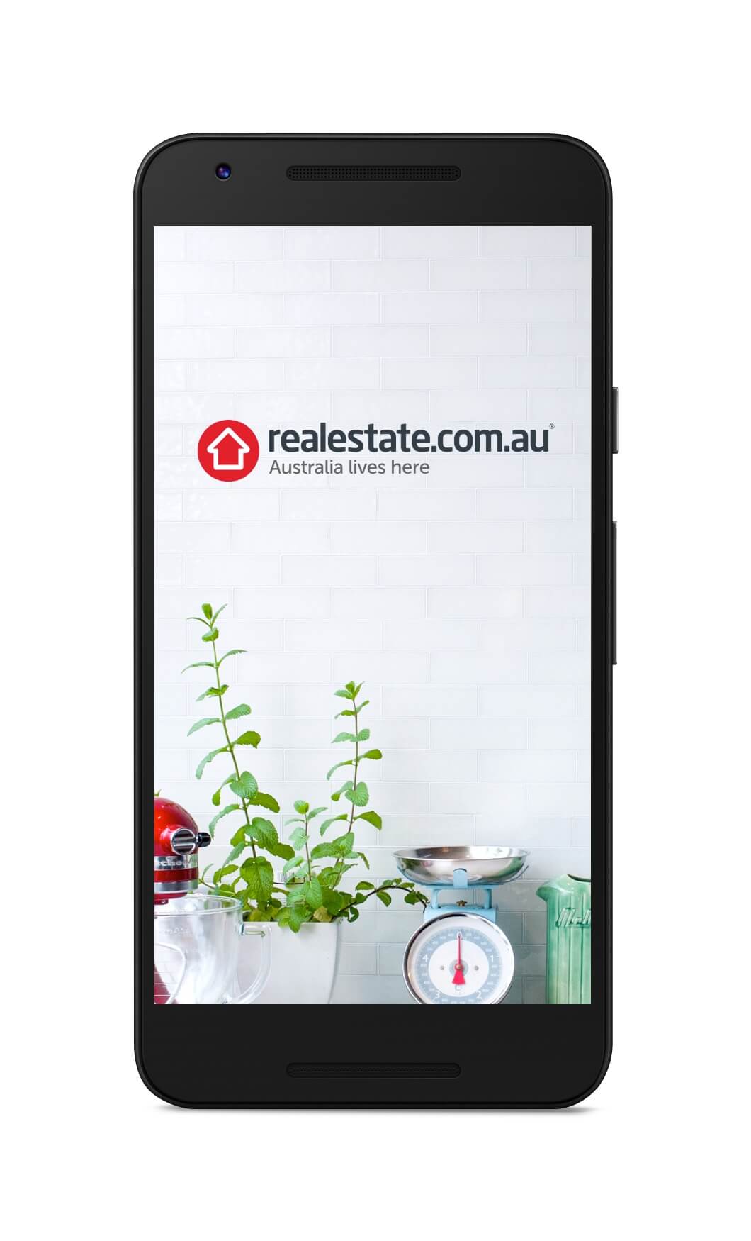
Hello, welcome
Hello, welcome
Working with a photographer, I wanted to set up a scene that created a homely vibe. This was to create an inviting first look at the app.
Working with a photographer, I wanted to set up a scene that created a homely vibe, this was to create an inviting first look at the app.
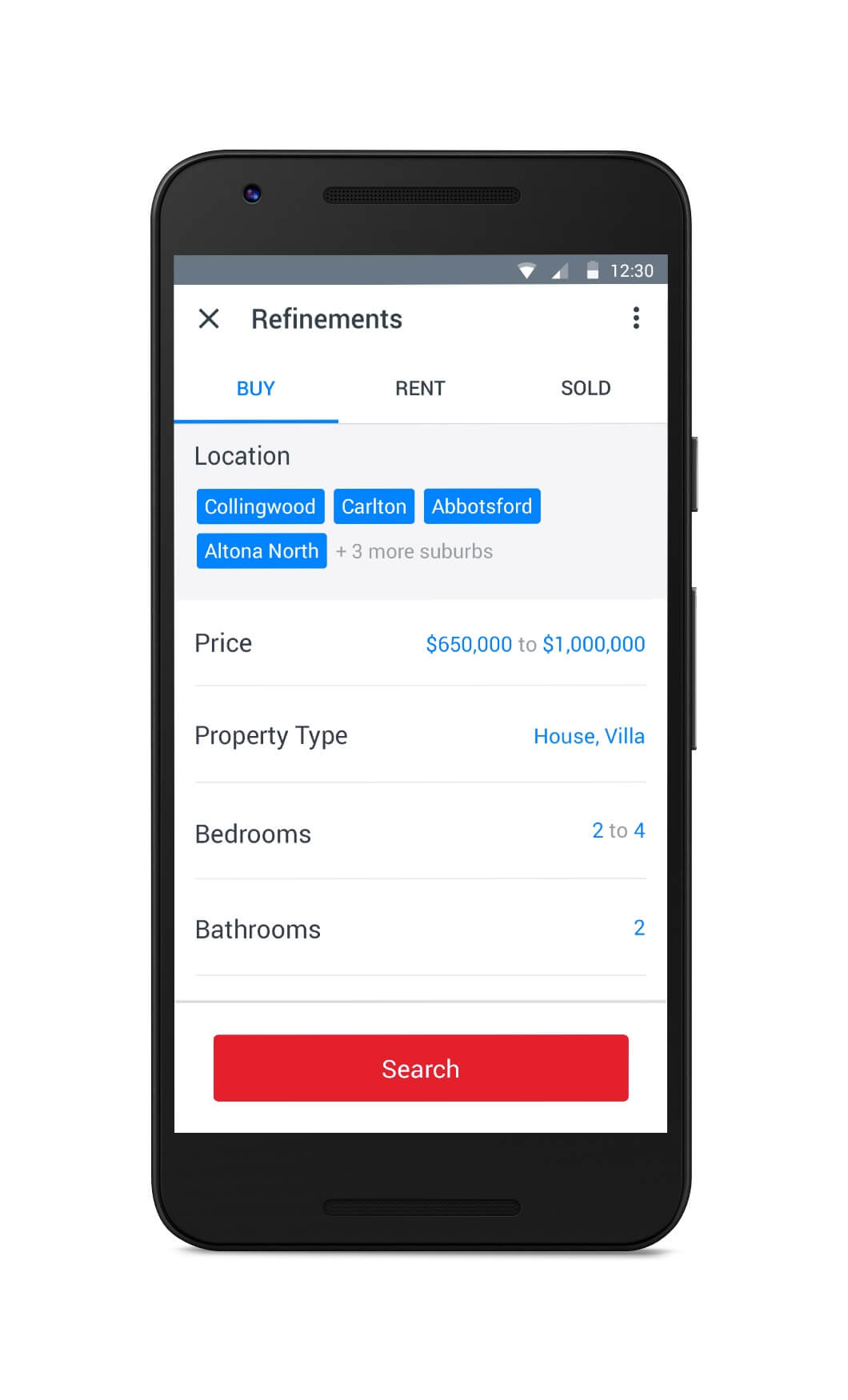
Choose what you want
Choose what you want
I wanted to give the feeling of space and control and give everything a place in which it lived. This cut down on the cognitive load and made the app feel quick and intuitive.
I wanted to give the feeling of space & control. Give everything a place in which it lived. This cut down on the cognitive load and made the app feel quick and intuitive.
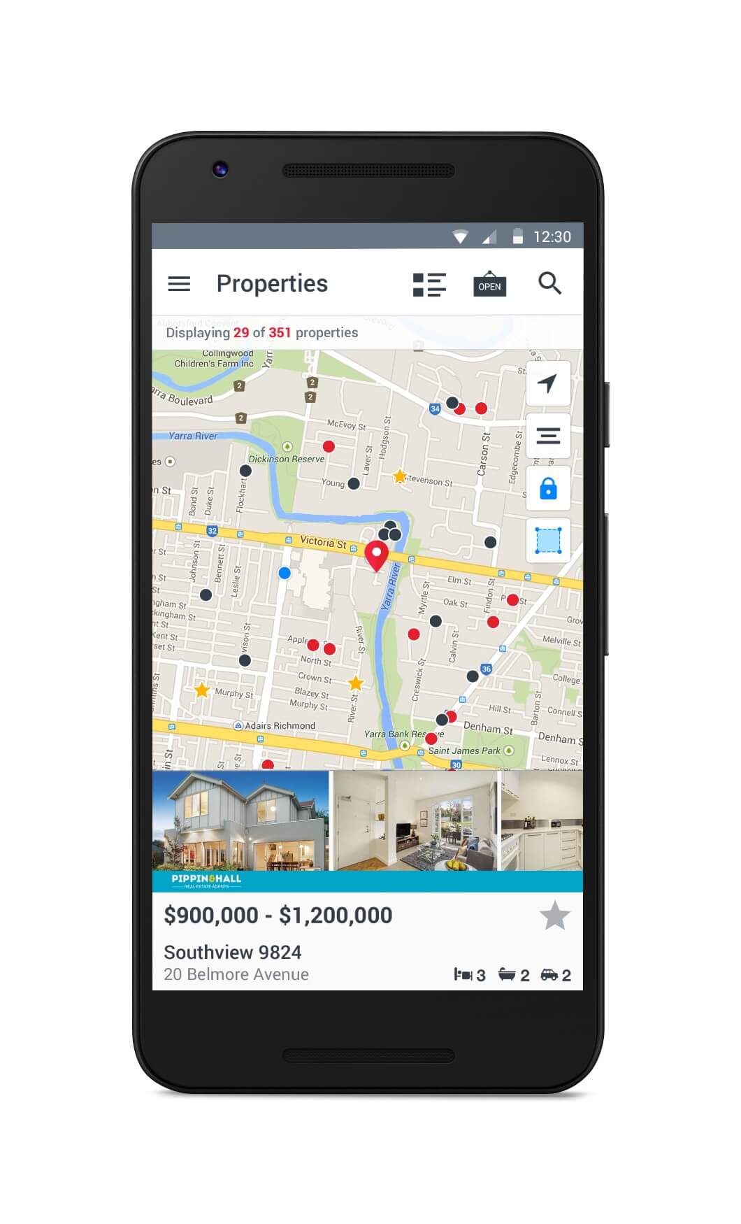
Where you want to be
Where you want to be
Our Map view was the first in the world to make use of finger search to create specific areas outside of the usual postcode/suburb search.
Our Map view was the first in the world to make use of finger search to create specific areas outside of the usual postcode/suburb search.
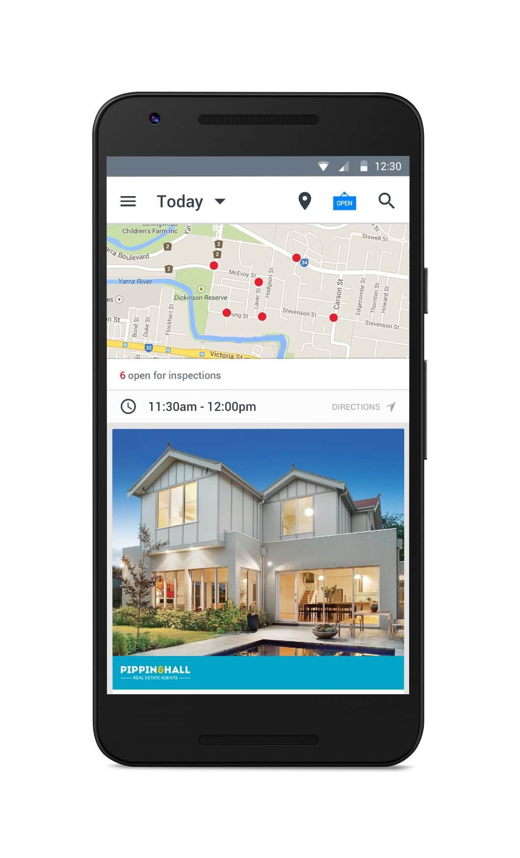
Your time, your pace
Your time, your pace
The inspection view was a combination map and list view, giving quick access to directions and times, so users were able to make decisions based what suited them best.
The inspection view was a combination map and list view, giving quick access to directions and times, users were able to make decisions based what suited them best.
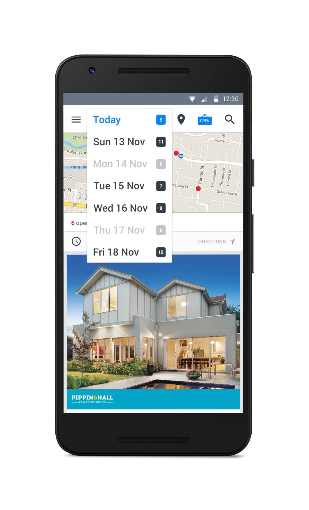
Plan your life around us
Plan your life around us
Being able to plan the week ahead was a key component of this planner, giving quick access to the properties with open for inspections that were within their search criteria.
Being able to plan the week ahead was a key componant of this planner, giving quick access to the properties that were within their search criteria.
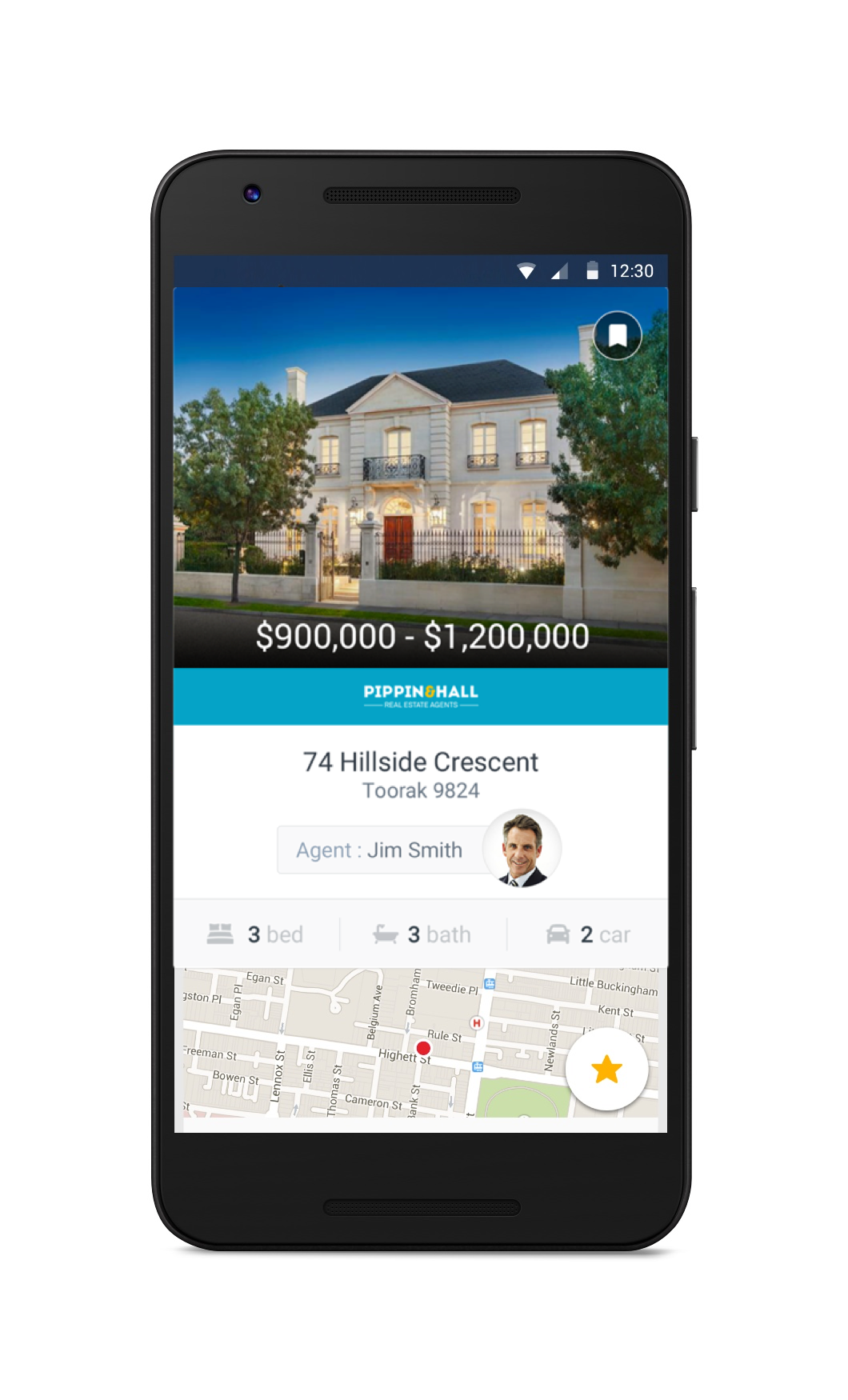
See what you want
See what you want
With the introduction of Material Design, I went big on images. Australia is fortunate that there is a lof of care and time spent on creating great photos, so I wanted to show them off.
With the introduction of Material Design, I went big on images. Australia is fortunate that there is a lof of care and time spent on creating great photos, so I wanted to show them off.
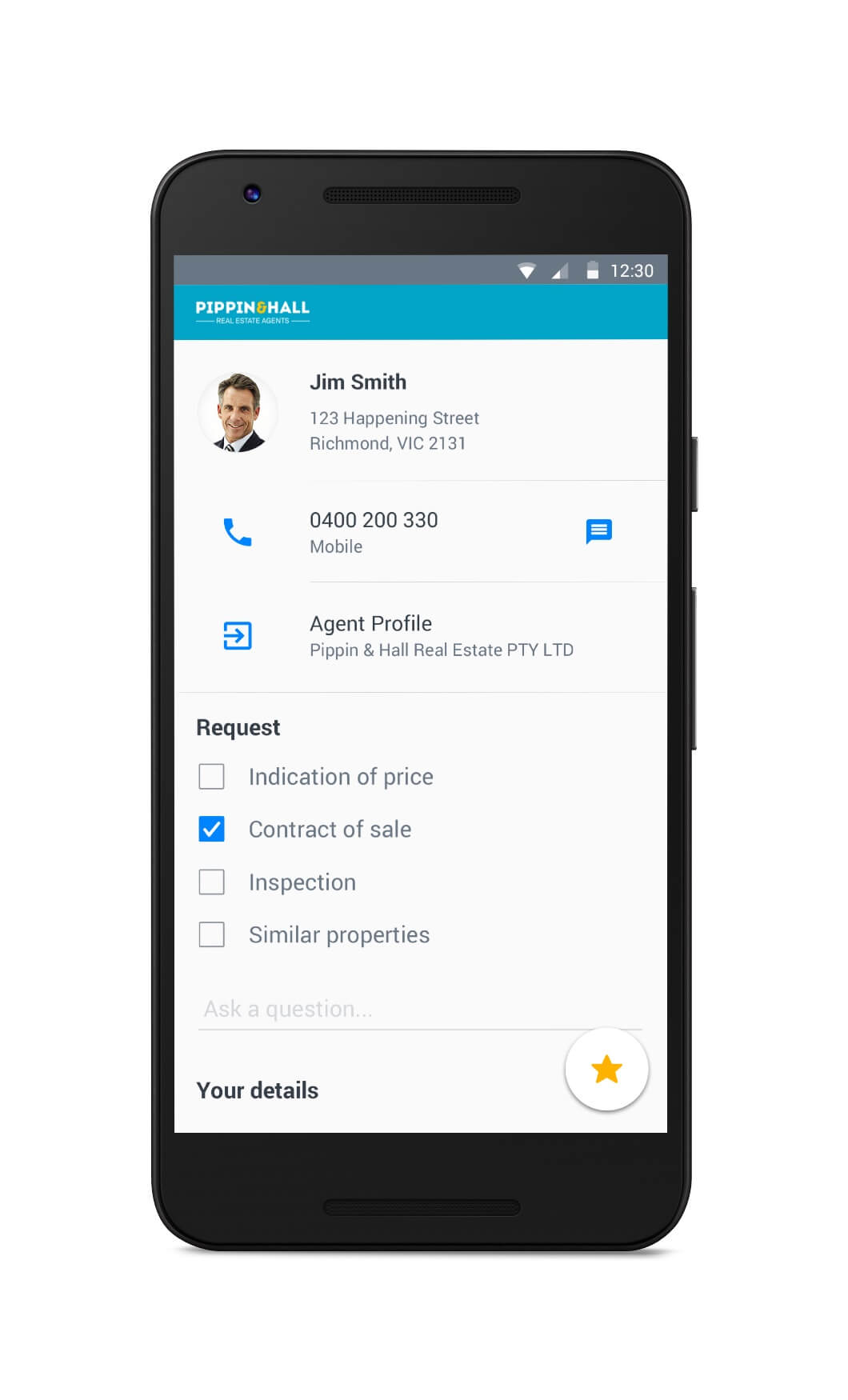
Speak to the right people
Speak to the right people
Being able to leverage the native Android OS we could now give the users options to call, message or view the agent right from the app.
Being able to leverage the native Android OS we could now give the users options to call, message or view the agent right from the app.
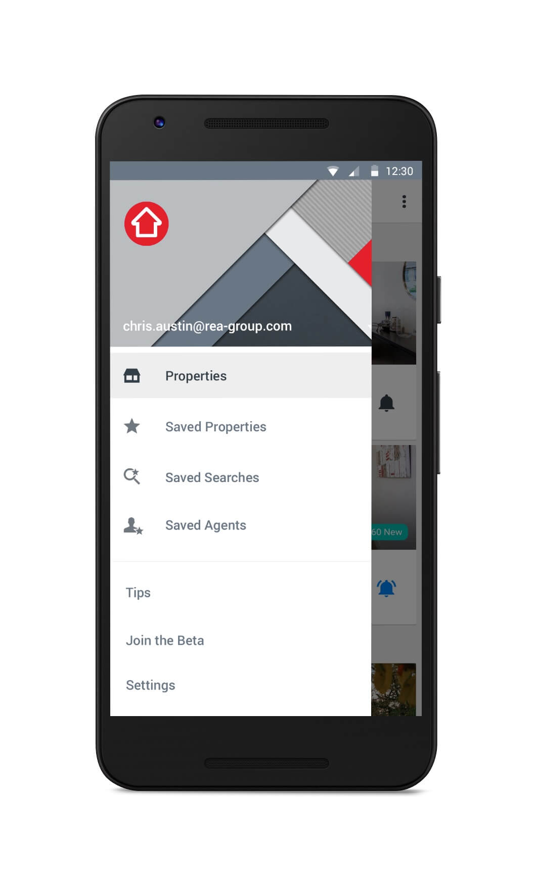
Find new things
Find new things
The navigation drawer allowed users to feel at home on Android, giving quick access to the features that they use frequently.
The navigation drawer allowed us to feel at home on Android. Giving quick acces to the features that they use frequently.
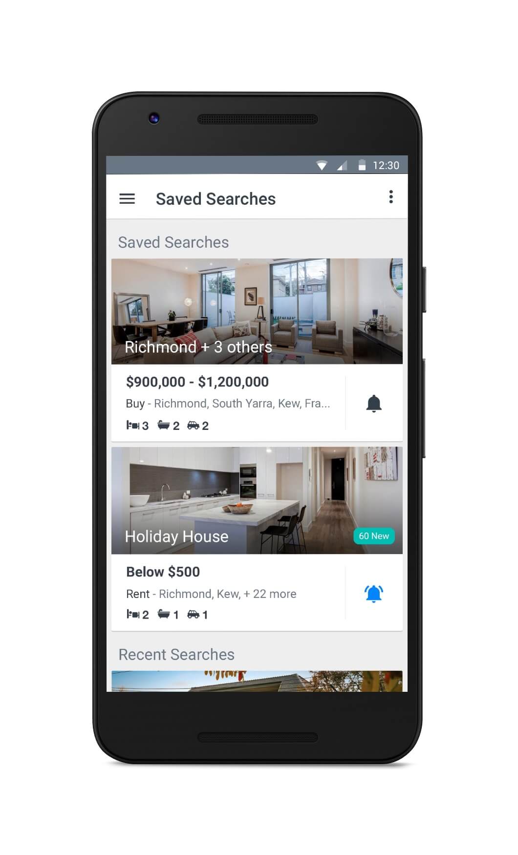
Keep and share them
Keep and share them
Another first for Australia was to create saved searches. This enabled the user to group their search results in one place and also share with family members or friends.
Another first for Australia was to create saved searches, this enabled the user to group their search results in one place and also share with family members or friends.
Impact
Impact
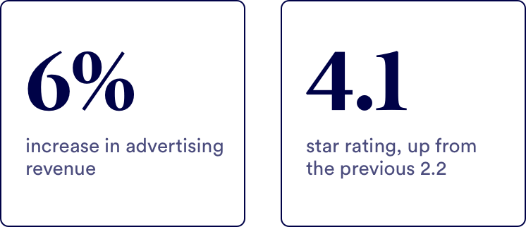
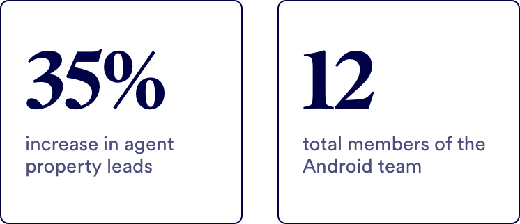
After we launched, we had a big marketing push alongside an outreach program where we reached out to users on the Play Store to encourage them to try the app again. We also held sessions with agents to inform them and get feedback on the updates. We saw positive results across the board, including but not limited to:
After we launched we had an outreach program to contact disgruntled users and agents, we saw positive results across the board including but not limited to:
Let's chat!
Currently open to new opportunities remote or in New York
